Cherry, rather irritatingly sell their switches in packs of 23…
I have some similar (cheap) Chinese ones in my current zynthian. They are not as deep (the smallest ones I found), but still more than I would like.
Indeed! When designing riban modular I found no suitable RGB switches. I had to build my own by putting a WS2812 RGB LED on the PCB next to a tactile switch with a translucent button push extruding through a front panel hole and with a lightbox around to stop interference / bleed from adjacent switches. Using a white lightbox also helped to increase lumens bouncing towards the button press. It works quite well but requires some fine tollerence in fabrication.
Zynthian uses a similar technique but uses a silicone membrane as the button press (with etching to reveal the keycap legends) with carbon contacts that push onto exposed PCB track to make the switch contacts. The WS2812 LED is mounted centrally for best optical performance and a pair of switch contacts are used on either side of this.
Ironically, probably the easiest option is use RGB Encoders, and ignore the rotary.
Yeah like we would…
why not use these cherry mx buttons ?
Thanks for bringing back this question at the right time. I did not comment on this as it seems quite obvious: those are the default colours defined for the LEDs, not for a display (however, they are actually significantly more readable on my QLED display than on the screenshots!). Of course the “fake wsleds driver” can define its own colours and not just inherit from the original LED driver. Anyway, it already does much more advanced (=dirty) “hacks” to achieve the switching of labels.
In addition, there are more open questions:
- the LEDs also use blinking (metronome) and pulsing (is it used anywhere at the moment?) - both use switching (or changing brightness) between black and the full colour - but on the screen we should rather change the transparency (unless we decide for a black background, of course)
- changing colour of icons needs to apply image composition, which is not a trivial calculation: blinking is probably OK, but for pulsing it would mean several dozens (if not hundreds) image compositions per second. That could possibly already have some notable impact on the system load!?
Yeah, choice of colours is the second worst problem of every implementation, just after the choice of names ![]() Or we may just avoid using colours at all and use just white on the grey (or black?) background (as mentioned before).
Or we may just avoid using colours at all and use just white on the grey (or black?) background (as mentioned before).
There are also some fully transparent key buttons available from Aliexpress, as I probably mentioned before. (Sorry, if you just don’t consider this a serious source of components. However, not always the quality is that bad.)
And as mentioned before, the Adafruit NeoTrellis is actually very similar in design and principle to the current Zynthian keypad. The difference is the controller, the 4x4 size and the high white membrane silicone buttons (with lot of the light bleed/leak). They also sell just the PCB with the LEDs and contacts (and the controller, unfortunately), so that you can make your own membrane, if you know how to do it.
Talking about momentary switches with led I need to mention that we need to discuss momentary foot switches as well.
F1-F4 should be also available as foot switches so that we can change z3s or enable/disable effects assigned to them or go through snapshots using foot switch.
This is very important if we are going to promote zynthian for guitarist and compete with mod dwarf or NAM pedal or tonex.
Zynthian is much more advanced device than any of these mentioned above because it is a proper synth and sequencer and daw but is lucking controls by foot that guitarist need.
Somebody will argue why don’t you plug just midi switch. That would be fine if we can do two way communication - zynthian should control foot switch led and it’s colour.
For example, in most digital pedals, effects are categorised in similar way as we did in Oram but they also have a default colour. Eg overdrives and distortions are orange, dynamics and EQs are yellow, delays are green, reverbs are light red, amps and IRs are dark red, modulations are blue etc. Hence when certain effect is assigned to footswitch appropriate colour is shown on the ring around it so that player know what each foot switch is assigned to. Snapshot is (zynthian sub snapshot) is always white. So if device is in snapshot mode than only one of F1-F4 leds are switched on with white colour.
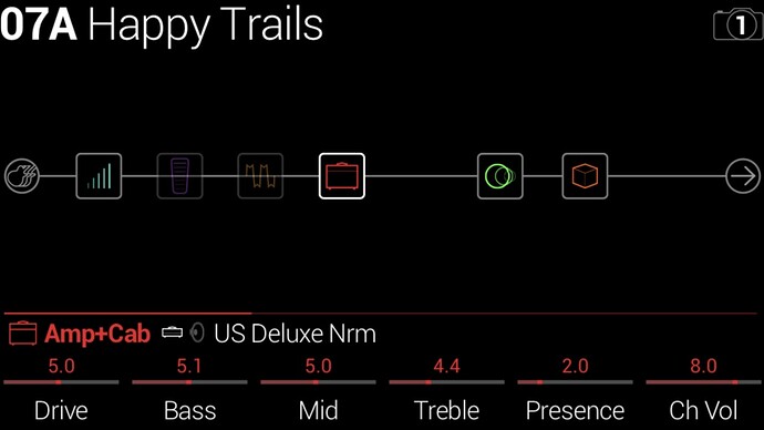
Also on the screen effect is shown as a box with default icon (not just colour). This is for a different discussion in regards of a new chain type that we should introduced called fx-stomp or guitar where we would only have effects and present them in a more pedal like way, similar to this:
Oh, … I didn’t noticed that ![]()
with 23 push buttons, you know that you can burn 3 of them and still can build a fully working v5 !
Comparing to the other one you’ve presented, they are smaller, much cheaper/piece and let you the availability to use RGB lighting leds if needed.
We don’t need a new chain type. This is an audio chain that has only audio effects fed from audio inputs and feeding audio outputs. We can develop a different, more graphical view.
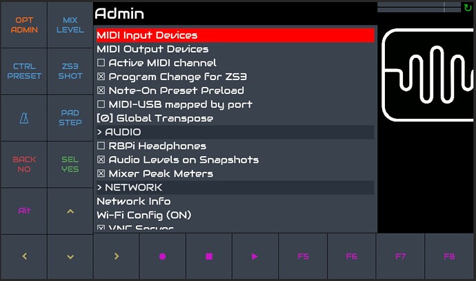
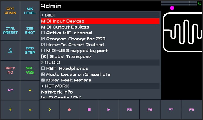
Trying the colours from zynthian_gui_config I am not overly happy either. Especially finding a non-aggressive red seems difficult. I came to the latest samples as shown here:
I think someone more competent in graphics should help with this. It also depends on the background colour. But I think the current one fits just well - and possibly better than full black. Using all the different colours as background instead of foreground would probably make things go completely wild, I guess.
Hi @wanthalf, first of all, this is very promising and I think you’re going into adding something that can be really helpfull for all of the “touch only UI” Zynthian’s users here. So keep on the good work.
Regarding your screenshot, I am a color blind ( but not “so heavy” to see the world all in black/white ;-), and I can hardly read the “back/no” , “alt”, “transport” and “F*” widgets.
I do not know if this is related to my color blindness or if the color palette isn’t that well choosen. Also, maybe increasing a bit the font (and icons) size could help.
Thanks for reporting! Yes, this is exactly what I was most afraid of. Someone competent should select the colours which are also safe for people with all kinds of colour blindness! Unfortunately, this is a task beyond my competence. Good to have such users in the community - people often just forget these things if they are not affected themselves.
In any case, we can always just return to white-only. As mentioned, on the screen we can also change the labels. But it would be more fun with some safe and pleasant colours. (Eventually, I already also have an idea how to change colour for just a part of the label - would be useful for the screen switching buttons.)
Accessibility is very dear to me. I do quite a bit of work in this field and am very aware of how inaccessible Zynthian can be. We try to find time to address this but we do not have that much spare time.
A general rule for accessibility is that colour should never be used as a primary indication of state or meaning. It can be very helpful for reinforcing state or purpose. Colours should ideally be selectable from users, maybe from predefined themes. Such themes should provide for the most common types of colour blindness (there are several) and for high contrast, e.g. black& white. There are online colour blindness resources that support designing and testing UI.
I have generally found it more effective to use dark coloured background and light (near white) foreground / text. This is often more ledgible and will generally pass contrast tests, which allows colour blind users to read the text, even if they don’t see the colour reinforcement. Contrast is more important than colour in this context. Also, if you don’t change the foreground / text colour then you can often use graphics / icons with alpha layer more easily - one png for the icon and vary the button background colour.
A screen full of colour can make a device look a bit toy-like and we have a leader (in @jofemodo) who voices concern about too much colour, or wrong colour, or ugly colour… (I have been the brunt of such critism many times ![]() .) Ultimately, @jofemodo will be the arbitrator but anyone with UI & UX design skills (better than mine) should get involved in these discussions.
.) Ultimately, @jofemodo will be the arbitrator but anyone with UI & UX design skills (better than mine) should get involved in these discussions.
We already have the ability to configure colours, font and text size in webconf. This could (should?) be expanded to provide more control over such accessibility features, including theming.
Zynthian can be used by guitarists (like me) but this is not its primary usecase. Indeed, its audio inputs are not suitable for direct connection from an electric guitar’s unbuffered pickup coils, being too low impedance and hence having poor frequency response. There are ways to correct this, the most simple to add an impedance matching pedal (like any Boss pedal) between the guitar and the Zynthian. (I am not advocating for Boss, they just happen to all have fairly good impedance matching buffers built in.)
For dedicated guitar footpedal that provides very similar functionality I would recommend looking at our friends at Mod. We share a lot of their software philosophy and even much of their open source code. The Mod Dwarf is a really cool bit of kit. (I cannot recommend from experiecne - I have not played with it!) If this is what you want then you should really check it out and support that project.
Of course, Zynthian provides a rich set of features that Mod does not and it would be good to provide better support for our guitarists, including foot pedal control with feedback, impedance matched inputs, etc. I doubt whether there will be a Zynthian kit in a foot pedal format. (That is already covered by Mod!) There is a Zynthian GitHub repository relating to foot pedals but it is old and not really optimal. There has been much discussion on interfacing a range of foot pedals including Behringer FCB1010, USB HID pedals, M-Vave Chocolate, etc. Maybe someone will make a pedal board with graphical feedback that they will sell / share. Something that implemented some kind of standard (or at least open) protocol could be good. Switches that sent messages and were configurable for toggle / momentary. Indicators that accepted messages that informed of brightness and colour. This sounds very much like the pads on a Launchpad et al! Maybe just implement that kind of protocol, i.e. MIDI note data for the switch. MIDI note data for the LED colour and intensity. Why has no one done this yet???
[Edit] Actually, maybe Blackstar Live Logic 6 is this pedal - but it costs £150.
This is exactly what I thought. I did not think that we should create a separate device. We can sell additional hardware such midi pedal that you mentioned above or very small small FET buffers for fixing impedance that can be simple plugged in between guitar cable and audio in. Or even enhance audio in with switchable FET buffer.
In regards of additional control hardware we could design and build ourself. I am still thinking should they be connected using MIDI 2.0 protocol or be custom zynthian USB HID devices. They need to be two way.
In regards of midi switches there are cheaper once that do this over Bluetooth like this:
I have a M-Vave but it has no state indication.
Well, now I hope that I have finally managed to integrate the touch keypad with all the screens, although I haven’t really tested absolutely everything (especially the midi_key_range, sooperlooper and control_xy are something I probably have not used (or even found) in the UI yet. But generally, the only two screens I allowed to take over the whole display area and hide the touch keypad are the splash and touchscreen_calibration screens.
At the moment, there are only two new environment variables used: one for activating the touch keypad and one for selecting left or right hand side layout. I don’t exactly know how the environment variables and configuration are managed (it has several layers, as I noticed), but I would prefer to avoid diving into the zynthia-webconf and zynthian-sys components unless necessary ![]()
So, we can turn back to the question of UX…
I have also had a quick look at this. The problem is that we are transferring a concept from one system -
buttons with RGB backlight, where the colour and brightness are the only way of indicating state - to a different system: a display where we have much more possibilities. The question is how much we want to imitate the original keypad and how much we are willing to diverge and use the wider possibilities offered by the display. Personally, I don’t think we need to imitate everything at any price. But I also like the colourful labels. Colouring the background instead of the foreground would be much easier to implement, but also make it “toy-like”, as you correctly observe.
So, we have several possibilities and I am mostly considering some variant of changing the labels or at least highlighting their relevant parts. The configurability is mostly your decision. The current wsleds have all the colours fixed, but I would also prefer to make the colours configurable, at least for the display implementation.
I am afraid the requirements for good contrast for people with a limited reception of colours and the aesthetic desires of those without these limitations are often in conflict. There are probably some cleverly chosen combinations which may satisfy both requirements at the same time, but not so many and not so easy to find. Anyway, I also believe that configurability is always a good answer to these contradictory requirements. But it is always a good idea to find some reasonably balanced defaults from the beginning.
By the way, when going into real details, we are (almost) all “colourblind” to some degree - I have both read and experienced myself that the distinction between “blue” and “green” is often very individual for many hues at the edge. And I also often notice that some hues are triggering the deteriorating sharpness of my (otherwise apparently excellent) vision more than others. It is mostly sharp blue LED lights on the night streets, but when looking for some acceptable hue of the red colour, I had serious problems to find one that would be easily legible as a foreground colour as well. (Maybe my eyes were already tired so late at night.) So, we all have some problems - either the colours are too similar or too aggressively dissimilar to be comfortably legible.
I have no idea about the world of guitar pedals, but you remind me of a related question raised somewhere in the discussions some time ago: the question of two way communication generally in order to report state changes. We discussed at least the possibilities of using some system of OSC subscriptions. That would be probably more useful for some more advanced control panels (and probably also just custom made, since I am not aware of any real products with such advanced - and non-proprietary! - capabilities). But maybe it could also be implemented in the form of a USB protocol or MIDI 2.0… (I have not studied the capabilities of MIDI 2.0 yet, but I also think they thought more about two way communication this time).
I tried an accessibility contrast analyzer. I am not sure how strict results I should follow. Green and blue are not a problem as long as they are light enough. But the more red is involved, the worse the results. It seems almost impossible to find a distinct hue of red and purple - the result is always a kind of very light pink/purplish hue (see the screenshot). It means there is a minimal difference between active and inactive MIDI recording. Fortunately, this is also indicated on the status panel at the top.
Maybe the purple colour as indication of ALT mode could be given up? In favour of e.g. yellow? I did not try comparing the different colours to each other from the perspective of any colour-blindness - that would be rather significant in distinguishing the AUDIO and MIDI record/stop/play buttons.


