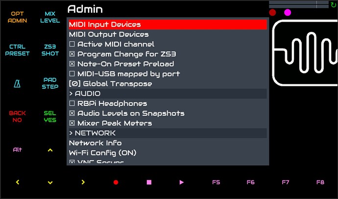
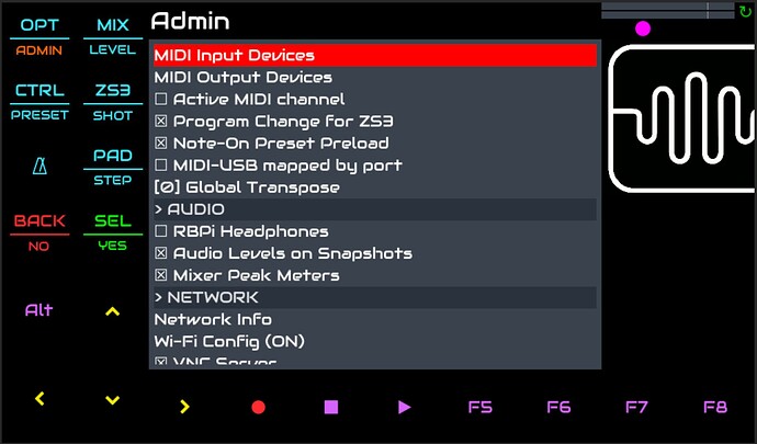
Using a black background would allow for a full red colour (and probably also the orange and purple hues). All the other colours are the same as above.
You will not find a single colour scheme that suits all types of colour blindness. You have to have several schemes that are for each type of visual impairment.
Much better with dark background. You should try to increase the size of symbols. You could use a larger font size for small texts or 1-char texts.
Regards
At least we need to keep the contrast ratio between the label and the background colour at the highest possible level. As seen above, it becomes unpleasant or even close to illegible for all of us otherwise. And we need to count with very variable quality of displays used for DIY zynthians. These cheapy little things are not something made by Eizo…
Otherwise, it probably depends on the amount of distinct colours one wants to use at the same time. Adobe has a free online tool which can help to solve this puzzle. There is a guide how to use it, but I didn’t really experiment with it yet.
No, this is not always beneficial. Some users find high contrast advantageous but it can make text difficult to read, especially if aliasing starts to occur. The contrast needs to be appropriate for the reader and we all have different eyes.
I took the default system size for onscreen buttons as base. But for most labels we can surely increase the size significantly. The problem arises with the widest labels - “PRESET” being the winner. I noticed you scaled down the text size of those (sub)labels on the physical buttons…
I meant the colour contrast as measured and evaluated with respect to the accessibility guidelines. I used this tool to assess the colours. I don’t know what the four different categories refer to, but I tried to “PASS” at least the three lowest ones. The fourth one was almost impossible with the default panel background colour and anything but white, yellow or very light blue/green.
It basically corresponds to what you mentioned above:
I have generally found it more effective to use dark coloured background and light (near white) foreground / text.
@wanthalf, at least for me, both images above are perfectly readable. I prefer the one with black baground.
In this case the black background not only improves readability but also looks like an external case ![]()
It makes it very clear that it’s not the usual touch screen interface that we all know. Lovely!
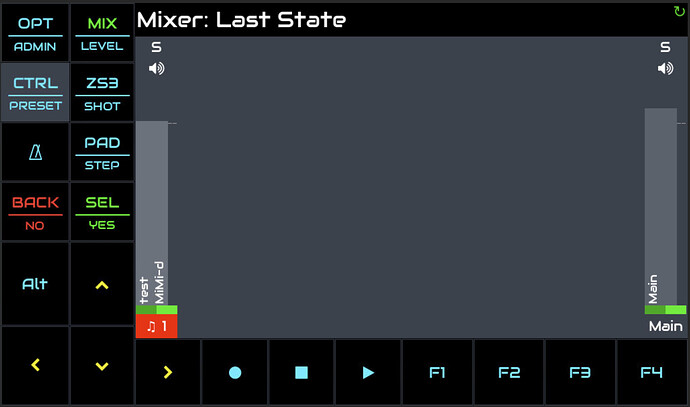
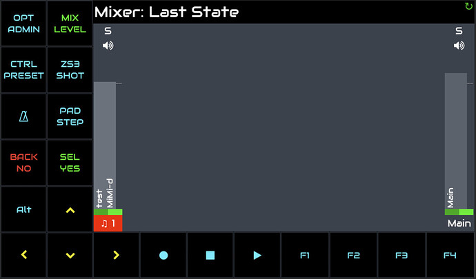
Very good point. It may benefit from borders on each button so that you can distinguish them clearly as individual buttons.
Just to show what I meant with partial colour change of the labels. It has several drawbacks, though…
Or in closer detail:


Yes, I also tried increasing the font size (except for the lower labels, just as @jofemodo does on the buttons). And since we seem to prefer the black background, I also dared to add slightly more saturation to the red, orange and purple colours again (still within the minimal acceptable accessibility contrast).
Adding borders unfortunately reveals that I am still unable to tame the grid autolayout of the tkinter toolkit – especially when combining image and text labels.
You don’t need the double labels. There is no advantage. When you press the Alt button the label can change. (Maybe knowing the bold press could be an advantage.)
Now I tried connecting my old V4 encoders back to use them as V5 encoders and it does not do anything. What am I missing?
The Wiring Layout set to “Custom”, Customization Profile set to “V5”. MCP config taken from V4, just with INTA/INTB wired to GPIO0 and GPIO2:
# Zynthian Wiring Config
export ZYNTHIAN_WIRING_LAYOUT="CUSTOM"
export ZYNTHIAN_WIRING_ENCODER_A="102,105,110,113"
export ZYNTHIAN_WIRING_ENCODER_B="101,104,109,112"
export ZYNTHIAN_WIRING_SWITCHES="-1,-1,-1,-1,-1,-1,-1,-1,-1,-1,-1,-1,-1,-1,-1,-1,-1,-1,-1,-1,100,103,108,111"
export ZYNTHIAN_WIRING_MCP23017_I2C_ADDRESS="0x20"
export ZYNTHIAN_WIRING_MCP23017_INTA_PIN="0"
export ZYNTHIAN_WIRING_MCP23017_INTB_PIN="2"
i2c detect can see the MCP at 0x20, but that is about everything.
According to @riban in a very informative post above, the V5 encoder switches should be mapped to switches 24-27 (21-24 in webconf) and not 0-3 nor 20-23.
So, probably this way? (24 times -1 and THEN the pin numbers?)
export ZYNTHIAN_WIRING_SWITCHES="-1,-1,-1,-1,-1,-1,-1,-1,-1,-1,-1,-1,-1,-1,-1,-1,-1,-1,-1,-1,-1,-1,-1,-1,100,103,108,111"
But that’s not the problem. Encoders should be the same. Am I missing something else or should I check the wiring deeper, add pull-ups etc.?
In the logs, I can now see:
startx[3007]: ZynCore->setup_behaviour_zyncoder(0, ...): Invalid index!
startx[3007]: ZynCore->setup_behaviour_zyncoder(1, ...): Invalid index!
startx[3007]: ZynCore->setup_behaviour_zyncoder(2, ...): Invalid index!
startx[3007]: ZynCore->setup_behaviour_zyncoder(3, ...): Invalid index!
Hm, there does not seem to be a problem in the communication. I can see register changes when reading the MCP using i2cget -y 1 0x20 0x12. (Unless there was a problem with the interrupts.)
Obviously I am missing some crucial concept. The wiring is OK. When I switch wiring layout to “Mcp23017 Zynscreen” (and adjust the changed INT pin), the encoders work as they did in V4. When I switch the layout to anything else (e.g. Custom), they do not do anything at all. How is this supposed to work?
“Mcp23017 Encoders” seems to be the right choice! I still don’t get the point, but everything seems to be hardwired in the zyncoder code (actually its build script, so it needs recompilation with each config change?). I am lost in the jungle. I don’t dare to ask what do those people select, who have their encoders wired to the Rpi GPIOs directly…
