I love it. Brilliant work mate. I hope this saves our sanity and that new users will finally understand the concept of categorised processors.
I think we can probably lose the Category and Engine selectors from the bottom right of the screen when you implement touch selection and scrolling. That will give more space for the description and it has always bugged me that this looks a bit odd.
I would love to see a “Favourites” or “Pinned” category which holds your favourtie processors.
Yes this is much more intuitive as a view, thank you @jofemodo !
Of course that brings new ideas now that you have a menu-submenu structure in place … would it make sense to have a similar organization in the chain parameter control view (chain processors on the left, parameters on the right) or would that take too much horizontal space?
Edit : if ever this makes sense, the (supposed) processor entries on the left could also link to the presets selector upon a bold press.
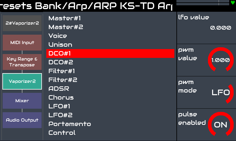
I’ve often wanted to change an effect parameter rapidly in a synth+effects chain (such as the new bypass) and the scrolling down to the effect can be quite long.
An alternative could be to show the controls for the current element only, once you are in the graphical chain view, for instance with a bold press on one of the processor fields.
Just some ideas to take or leave, anyway I’m having great fun with vangelis…
We don’t have these reminders on most other screens. We could add pop-out panels from the side with this info on as a means of help that could be triggered by user action or we could add a one-time user help overlay for the first time a user accesses each view that shows them their way…
I would actually appreciate a unified, much smaller version of these reminders. Especially while trying the new zynbleton sequencer I oftentimes missed a small hint about context dependent encoder functions.
Maybe there could be a really slim section at the screen indicating rotating as well as short, bold and long press actions for each encoder (except the engine parameter view of course or any screen already indicating parameters directly).
I agree that for the engines list, the reminder isn’t needed as one already navigations Admin etc without this help.
For the categories I can think of two potential options:
Put the categories list close to the encoder that selects it, so either
a) move it to top right to preserve the existing encoder mapping (preferred for existing users), or
b) map the first encoder to the categories selection. On my V4 it doesn’t do anything in this screen.
add a global help shortcut , which would overlay current screen with short/bold/long help
I like the idea of a user action, e.g. ALT+button to show a help overlay which give the user some info on what does what. This is a temporary overlay that is accessible from the user action (TBD). It may be an extra support burden but it may reduce documentation requirements, i.e. we document within the app.
I agree @riban, and this was exactly the kind of UX and UI improvement I wanted to suggest lately, reflecting on a growingly articulated workflow, based on a fixed set of multifunctional physical (or tactile) controls, which by definition don’t allow the same degree of UX flexibility as a screen+pointer graphical interface. I honestly hesitated to publicly advance the idea of a contextual help overlay, ignoring how much CPU overhead and maintenance work it would have possibly entailed.
I think the consecutive next step is keeping the bottom track handles in this view for usable horizontal track navigation. Basically in every view that is somehow track specific.