Yeahhhhh! You catched me!! ![]()
We have to put the back button somewhere. If HTML occupies the whole screen there is nowhere to put it. I don’t think adding topbar will break the effect. We have controllers in that space below the topbar everywhere else. It would actually give a more accurate depiction.
I’ve implemented touch navigation (vertical drag & swipe) in the help view. Also up/down arrow keys. Bold-push anywhere to back (exit) from the help view. Perhaps a horizontal swipe could be better, like we normally do in our mobile devices.
Still not convinced of adding the topbar … neither totally closed to do it. Just exploring the possibilities, mate ![]()
All the best!
I worry that this is inconsistent navigation. We use an onscreen back button everywhere else then have a swipe gesture here. How is the user too know what action to take where?
When touch-widgets are enabled I could easily add a fixed back button on the top-left. Not problem with this. Just exploring possibilities …
A back icon will obscure some of the help. I am not a fan of floating buttons that obscure the content.
We also need to decide how to access help from a touchscreen. ![]()
Bold ALT is not configured to show help in vangelis webconf HARDWARE->Wiring V5 Customization Profile. This has Switch-5 Action: Ui Action Push with Push: Toggle Alt Mode. I wonder whether the profile didn’t get updated or whether it got mangled when merging touchkeypad?
[Edit] @jofemodo I think it should be: Switch-5 Action: Ui Action Release. Short : Toggle Alt Mode. Bold : Help.
This should be automatically managed by update system:
#Setup new ALT button functionality
set_envar.py ZYNTHIAN_WIRING_CUSTOM_SWITCH_05 UI_ACTION_RELEASE
set_envar.py ZYNTHIAN_WIRING_CUSTOM_SWITCH_05__UI_SHORT TOGGLE_ALT_MODE
set_envar.py ZYNTHIAN_WIRING_CUSTOM_SWITCH_05__UI_BOLD HELP
This is from the update recipe for patchlevel=“20241113.1”. If this recipe, for some strange cause, was not performed in your system, it can be run by hand from the terminal.
Regards,
Doesn’t that just set the envars but not the profile that webconf can load? Even after setting these, if I reselect V5 as Customization Profile in webconf it restores the old, wrong configuration.
[Edit] It seems to be these lines in /zynthian/config/wiring-profiles/v5:
ZYNTHIAN_WIRING_CUSTOM_SWITCH_05="UI_ACTION_PUSH"
ZYNTHIAN_WIRING_CUSTOM_SWITCH_05__MIDI_CHAN="Active"
ZYNTHIAN_WIRING_CUSTOM_SWITCH_05__MIDI_NUM="0"
ZYNTHIAN_WIRING_CUSTOM_SWITCH_05__MIDI_VAL="0"
ZYNTHIAN_WIRING_CUSTOM_SWITCH_05__CV_CHAN="0"
...
ZYNTHIAN_WIRING_CUSTOM_SWITCH_05__UI_PUSH="TOGGLE_ALT_MODE"
ZYNTHIAN_WIRING_CUSTOM_SWITCH_05__UI_SHORT=""
ZYNTHIAN_WIRING_CUSTOM_SWITCH_05__UI_BOLD=""
ZYNTHIAN_WIRING_CUSTOM_SWITCH_05__UI_LONG=""
ZYNTHIAN_WIRING_CUSTOM_SWITCH_05__UI_ALT_PUSH=""
ZYNTHIAN_WIRING_CUSTOM_SWITCH_05__UI_ALT_SHORT=""
ZYNTHIAN_WIRING_CUSTOM_SWITCH_05__UI_ALT_BOLD=""
ZYNTHIAN_WIRING_CUSTOM_SWITCH_05__UI_ALT_LONG=""
Ups! You are right! I forgot to update the profiles. I will do.
Done!
Hi @zynthianers!
Those of you with graphic design skills are very welcome to collaborate in our effort to make UI more friendly. We need a good icon set and as nerdy developers we are, our design skills are scarce and flaky.
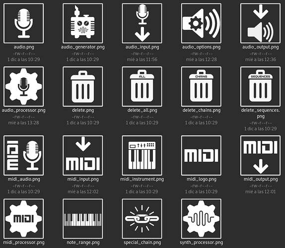
We managed to create an initial icon set that you can test in the vangelis branch:
but we need many more, and probably, improve some of the current ones.
Feel free to comment ideas or propose icons for specific menu entries or categories/subjects that doesn’t have a proper icon yet or improve the current set.
The rules:
- Iconic enough.
- Fits current style / aesthetics
- Monochrome / greyscale with transparent background
- 300 x 300, but they should still work well-enough when down-scaled to 60x60, what is done automatically, for instance, when displayed in a 3.5 inch display (V4).
- Weight under 10K. Never above 20K! Use alpha channel with care and adjust PNG options and metadata to keep the weight under these limits.
Our current priorities are:
- Main / Chain menu
- Chain options
- MIDI input / output
- Admin menu
You will find the current icon set in the zynthian-ui repository:
zynthian-ui/icons at vangelis · zynthian/zynthian-ui · GitHub
Thanks!
I’m really glad to see this change coming. Having used Zynthian for a bit over a year, contextual help would be high on my list of suggestions. I can see a few places it really helps:
- While Zynthian is reasonably easy to pick up (credit to devs and contributors)…if you happen put down your Zynthian for a while (heaven forbid!)…after returning and wiping off the dust, you need a nudge to get back into the workflow
- You use Zynthian for a specific reason like guitar or keyboard performance and decide to delve into another area of the software. Zynseq is a prime candidate for needing some contextual assistance
- @jofemodo Introduces a new feature
 and users can get some insight into what it does directly in the interface without having to dive into the forums
Regarding your request for icons, I actually work closely with designers skilled in this area. I can’t make any promises but if I try my hand at this, I may at least be able to get some guidance or constructive critique from them to make an appropriate set of icons. I have been out of action for a while so haven’t contributed to the wiki since Oram but would like to help where I can

This could be reconsidered. ![]()
Do you have a better proposal?
Just a suggestion:

He he! I hadn’t even noticed the esoteric keyboard… Shows how much attention I paid to that icon!
[Edit] Maybe it is because I am a guitarist! 6 strings is plenty. Why bother with all those funny coloured keys?
Sorry, but it puzzels me all the time.
Thanks for the improvement!
Nice @spurkopf,
And if I may advance a further improvement, I would push the icon closer to the boundary where its spatial or objectual reference starts becoming ambiguous, or unclear in signification (since good iconic communication requires regressing to the basic spatial paradigm implied by the reference of the sign).
Therefore, practically, I would suggest to delete those abstractions of panel controls, leaving just an empty band in the upper part. That would make the icon conceptually more accomplished as a sign standing for a Midi instrument, and visually more scalable.
Best regards ![]()
