Just a mashup, I’m not talented in graphic things.

![]() Incredibly fast, @riban has already changed the icon in vangelis.
Incredibly fast, @riban has already changed the icon in vangelis.
Did you ask AI to create this ?

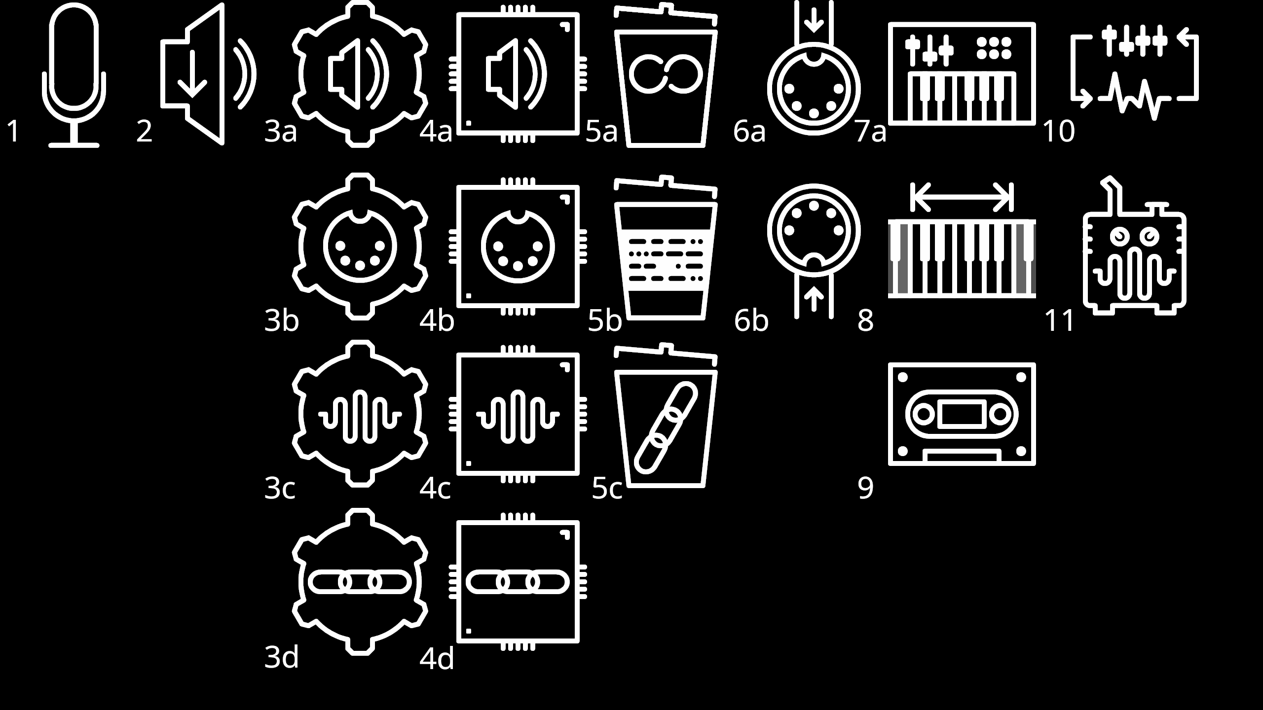
Ok, here’s my first go at making a set of icons. It was kind of fun once I got started but I didn’t want to go too far before getting some feedback. I realise wading into these things can be contentious as some people have attachments to different things (see any open source project logo). Some of the goals were to: have consistent line thickness, avoid use of words and keep roughly the same size (visual weight)
I started at 60x60 and expanded them up to export (300x300). They are using a consistent line thickness of 2px (at 60x60) so that should help if they are scaled to other sizes if they are multiples. Many of the existing ones were using solid blocks of colour, I wanted to focus on a pure line art version at first. If it’s desired, I could attempt a set that use the solid colour inside the graphic. There are lots of little adjustments that can still be made. Some of them push right up to the edge of the 60x60 bounding box so if that needs some more space in the context of the menus it can be adjusted.
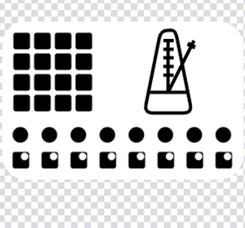
I added some numbers as this could make an interesting little game, feel free to respond with what you think the icons represent! (Hint: I used the original set as a base to work from). The #3 & #4 sets are variations for the same item
5 Likes
My first observation is that MIDI in/out is simply rotated but arrow flow is still inward. The 5-pin DIN should always be the same orientation and the arrow changed to enter or leave. (MIDI is well known for intentionally mounting the socket upsidedown.)
Hi @LFO !
Thanks a lot!! It would be super-cool to have a homogeneous icon set and you seem to have started the task. I like the general lines and the simplicity. Let’s work in this reduced set to find the exact taste and extend the set later:
My initial comments:
2 => Is the down arrow needed? A speaker is always an output.
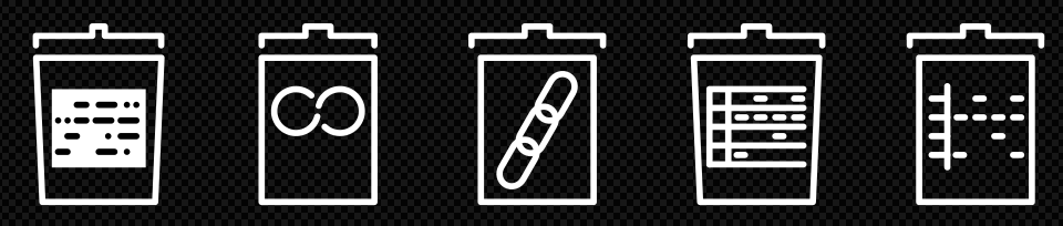
5 => Could we try with a closed bin?
5b => I don’t understand this one
4 => I don’t understand the “kind of chip” envelope. Is this input/output? Routing?
I don’t like using the DIN-5 connector as MIDI icon. I like more the MIDI logo, that is well known and simple enough. From my POV, using the “DIN-5 connector” as general MIDI icon could be confusing and will cause conflict when we want, for instance,a specific icon for the DIN-5 port options, USB-MIDI or BLE-MIDI devices, etc.
The best,
1 Like
These look great!1
2 - Yes I think you’re right, I saw many arrows in the original set and thought they might be missed. Leaving space in the middle of the icon does allow them to be added if required for an extra reminder.
5 - Here are a few bin variations. I think the tilted lid helps identify the bin with less lines. Some of these start to look like a clipboard or something. Just need to tweak the details like lid overhang and the angled shape to help identify it.
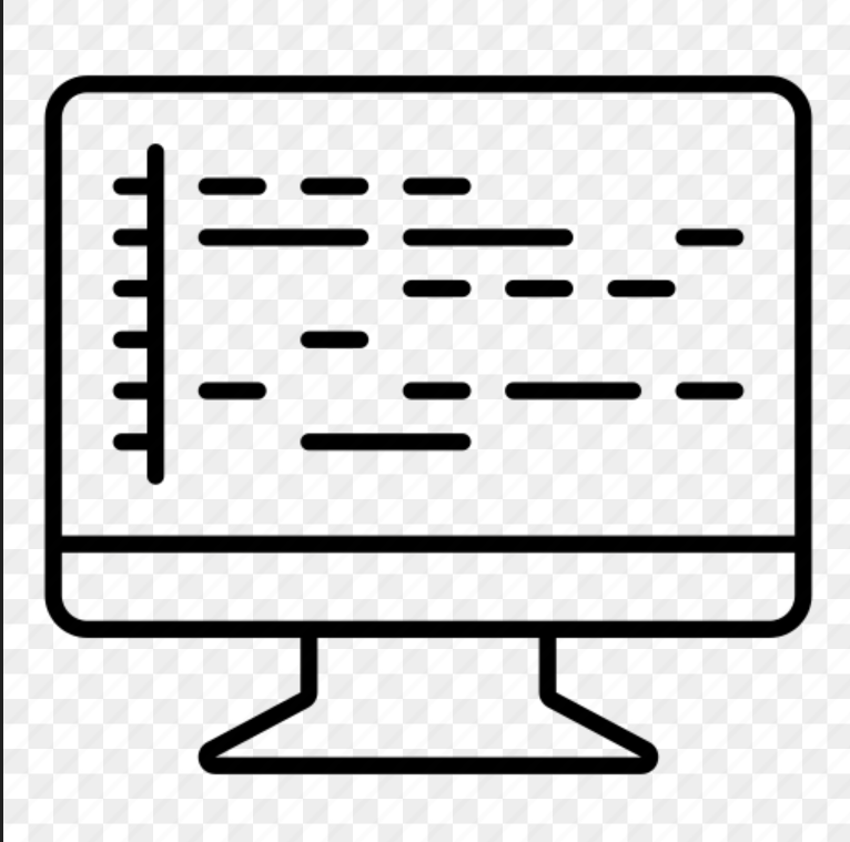
5b - I was struggling to find a way to graphically represent sequences so this is what I came up with. When I searched for ‘sequencer icon’ I found some interesting looking ones which gave me some ideas (last two above). We don’t have the luxury of colour so it’s a challenge to find a way to represent it with very little detail.


4 - The chip is the ‘processor’ which is the word used interchangeably with CPU. So it becomes: audio processor, midi processor etc.
Regarding the 5-pin midi icon, my argument for a graphic is:
- Ideal goal would be no words. After all, why say ‘MIDI’ on the right side of a menu that already says it?
- The typeface of the logo is different to the default Zythian one which makes it look inconsistent.
If we know all the situations where midi needs to be represented (midi+bluetooth, midi+usb etc.) then I can try to come up with a graphic that can represent them all. I think the approach of creating a large icon with secondary information inside like the bins could work.
@riban The pins should be on the bottom with the PCB or is that what you meant…they are upside down?
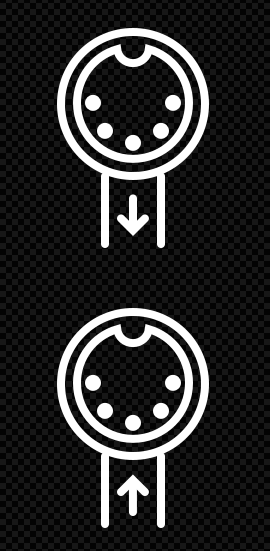
In the 1970’s and 1980’s the 180° 5-pin DIN connector was typically used to interface audio (often cassette) on HiFi music centres. It was always mounted with the pins at the top and the notch at the bottom. When MIDI was designed, they reused this ubiquitous connector (probably because it was fairly robust, cheap and easily obtained) but inverted its orientation, probably to distinguish it from the very common HiFi use of the time. So I always think of the MIDI connector as being upsidedown.
That is rather the point. It is the logo of the MIDI Association which rather well portrays what it is.
We must avoid compounding this confusion. Do not use a CPU (microchip) representation. We abstract the word “processor” from “audio processor”, “MIDI processor”, etc. It represents a module that processes audio or MIDI, including generating it.
Yes, I found this a struggle too. My (lame?) effort was this which tried to convey the elements of the zynseq:
Why “no words”? I prefer a more pragmatic approach. Priority shouldn’t be “have no words”. There are higher priorities, like meaningfulness and clarity. MIDI is an acronym and everybody know MIDI by its 4 letters. From my POV, using the MIDI logo for representing the MIDI concept is the less confusing and more clear way of doing it, specially when you want to represent a lot of MIDI-related concepts like USB-MIDI, bluetooth MIDI, DIN-5 MIDI, MIDI input, MIDI output, MIDI processor, etc.
I like the concept of being an envelope so you can put inside the MIDI logo, an audio wave, etc.
@riban is right when say we are not thinking of a CPU when we say “processor” in the zynthian context, but anyway, the processor concept as a worker blackbox with inputs and outputs is well catched by a chip icon or something similar. We could work on this to find the right taste.
Regards,
This is more hieroglyphic than iconic. We could use it for a Osirus-centric zynthian version ![]()
Could we try using the traditional music symbols for notes? They are universal and a “sequence of MIDI events” is mostly a “sequence of notes”.
Regards,
2 Likes
The trouble with words is the soon following concept of languages. Frameworks do this sort of stuff but it’s a big overhead. Do we see ourselves as purely English or are we to enjoy maintenance of multiple unicode sets and text direction?
1 Like
I’m not suggesting ‘no words’ to be stubborn. When I saw the request for a set of icons I immediately understood this as a graphics only exercise. Go check any icon set if you don’t believe me!
I agree the MIDI logo is something with a long history that makes it very recognisable. However, it is a logo rather than an icon. So we have more flexible rules to the request than I originally understood. I would still advocate for a graphics only approach, especially given the icons will be accompanied by a menu item for extra context. @wyleu Highlights another benefit for graphics only which avoiding the language problem. Although you could argue the midi logo is obvious enough for anyone with a moderate interest in music tech no matter their native language. In any case, I can look at some ways to communicate the various midi menu items that incorporate the logo plus an additional graphic such as arrows and bluetooth symbol.
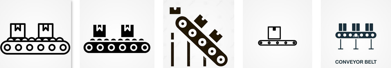
Regarding the processor icon, it is a literal translation of word to graphic which is one approach to abstract something. The original cog can be understood as a part of a machine which ‘processes’ things so it’s reasonable enough. The other thing that a cog is often used for is a graphical way to represent ‘options menu’. Any other ideas for this? A conveyor belt maybe?
For sure, this is the challenge of abstraction. How do we convey meaning with as little information as possible? In a user manual you want to see every button and dial represented so you can know what it does. For an icon you just want enough to provide a hint so it might only be a few dials or sliders (like the midi keyboard icon above). Artists use this trick all the time when drawing, no need to draw every leaf on the tree! You brain fills the rest in automatically…
1 Like
Hi folks! ![]()
I noticed that, by now, the subject of Zynthian interface iconisation has shifted here, from the other thread initiated by @stojos, Time for a graphic UI/UX? Thanks to @LFO for his voluntary commitment in this area!
I would like to point out, hopefully without sounding pedantic, that visual signification of functional procedures requires a specific kind of abstraction, called iconic reduction. Differently from artistic stylisation or logo design, where an arbitrary number of visual traits of the real object (reference) is substracted from its representation, in iconic reduction there are two requisites to attain:
-
The icon should possess the minimal set of spatial articulations that make it recognisable as a sign (“something that stands for something else”).
-
The graphical implementation of the icon should allow for its unequivocal association to the reference at every visual scale, therefore not being specific of the sign’s dimension.
The latter aspect is a common requirement with logos, and both are crucial for affording scalability between resolutions and sizes.
Therefore, I would suggest, in the UI places where it really proves feasible and effective to switch to a icons-based UI, to keep the level of graphic detail as low as possible. Otherwise, we might end up designing an interface which is more in the area of stylisation (with enigmatic hieroglyphs, which is perfectly legitimate but as an aesthetic process) than in the purview of iconic abstraction, thus possibly obtaining conceptual ambiguity where we should aim at attaining universal clarity and procedural immediacy.
Just my earnest advice!
All best regards ![]()
1 Like
These are different discussions.
The discussion here relates specifically to the icons used in the contextual help, i.e. the icon shown in the top right of the screen when a list box or similar is shown. The other discussion relates to a proposal to provide a more graphical presentation of data and navigation.
![]()
![]()
Just another opinion, without any scientific background. For me, the meaning of @jofemodo icons is easier to understand at first glance. Midi in particular is no longer the old 5-pin socket. It can also be USB or Bluetooth. For me, the Midi emblem is appropriate here.
6 Likes
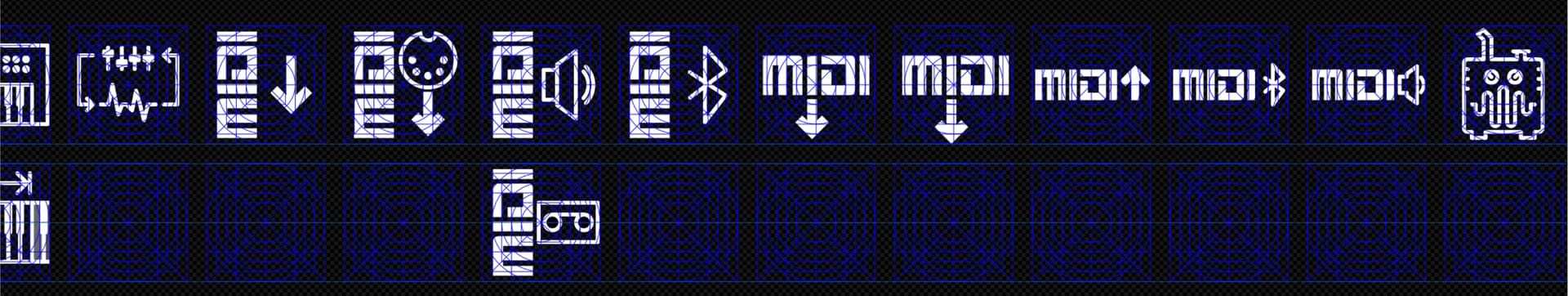
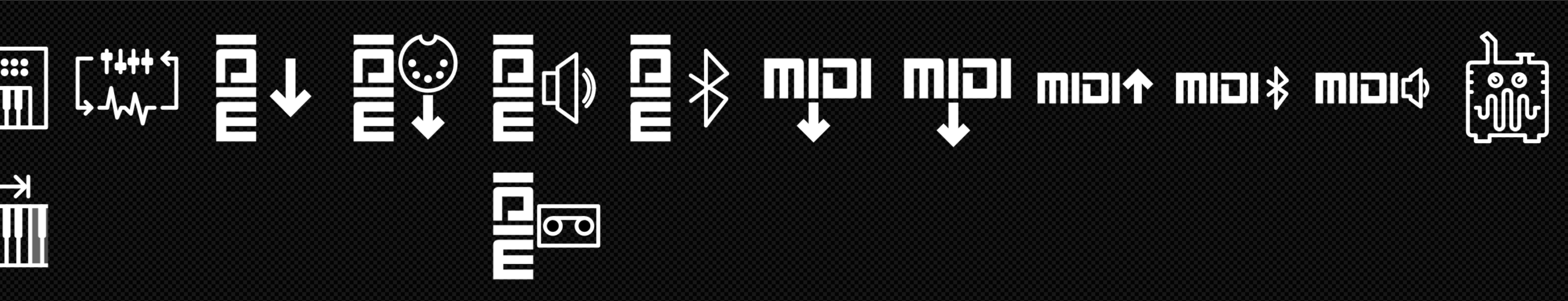
Some more attempts based on the midi logo. This is the grid I’ve been working off which helps create some balance between the various icons. I think the vertical midi fills out the space well and allows a variety of icons to be paired together for the function. The horizontal one also looks ok by itself but the size compared to the other icons is not balanced.
4 Likes
I like more the icons with the MIDI logo. Please, let’s follow this path. I also think the vertical MIDI fill better the space and the resulting icons are more balanced. My biggest doubt is how to represent generic “MIDI Out” and “MIDI In” (no USB, bluetooth or DIN-5). The arrow up/down is confusing. What is IN, down arrow or up arrow? Perhaps we could use something like this instead?
Regards
3 Likes