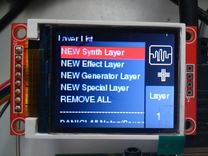
Layers:
Note that 8pt font renders poorly but is legible. Smaller fonts are too difficult to read.
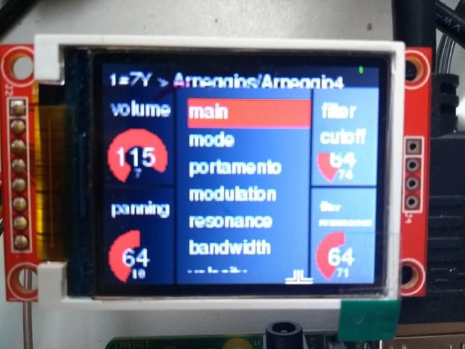
Synth control:
Note that parameter name obscures parameter value image. Maybe we could limit (truncate?) parameter names for low resolution screens. This could be an issue for any screen so maybe there should be some form of intelligent adjustment of on screen elements based on screen real estate (resolution).
So it isn’t too bad but could look nicer. As a rough and ready interface it kinda works.

