Is the bit at the bottom a representation of each of the value widgets? Is the 3 digits the MIDI controller number? Do you anticipate this being at the outside, i.e. left for the left two widgets and right for the right two widgets?
Oh - it matters!
Is the bit at the bottom a representation of each of the value widgets? Is the 3 digits the MIDI controller number? Do you anticipate this being at the outside, i.e. left for the left two widgets and right for the right two widgets?
Oh - it matters!
Yup the four corners! Using horizontal bars instead of arc shapes. The 3 digits would be the current value (like the normal UI, right?)
Maybe I can mock up a pixel by pixel version tonight! I’d love to.
Ironically it is probably easier to interface with the SSD1306 than the thing I have. Now, how do we present the UI via a single pixel? MorseZynth anyone?
As long as it was MIDI status I’d probably be content . . .
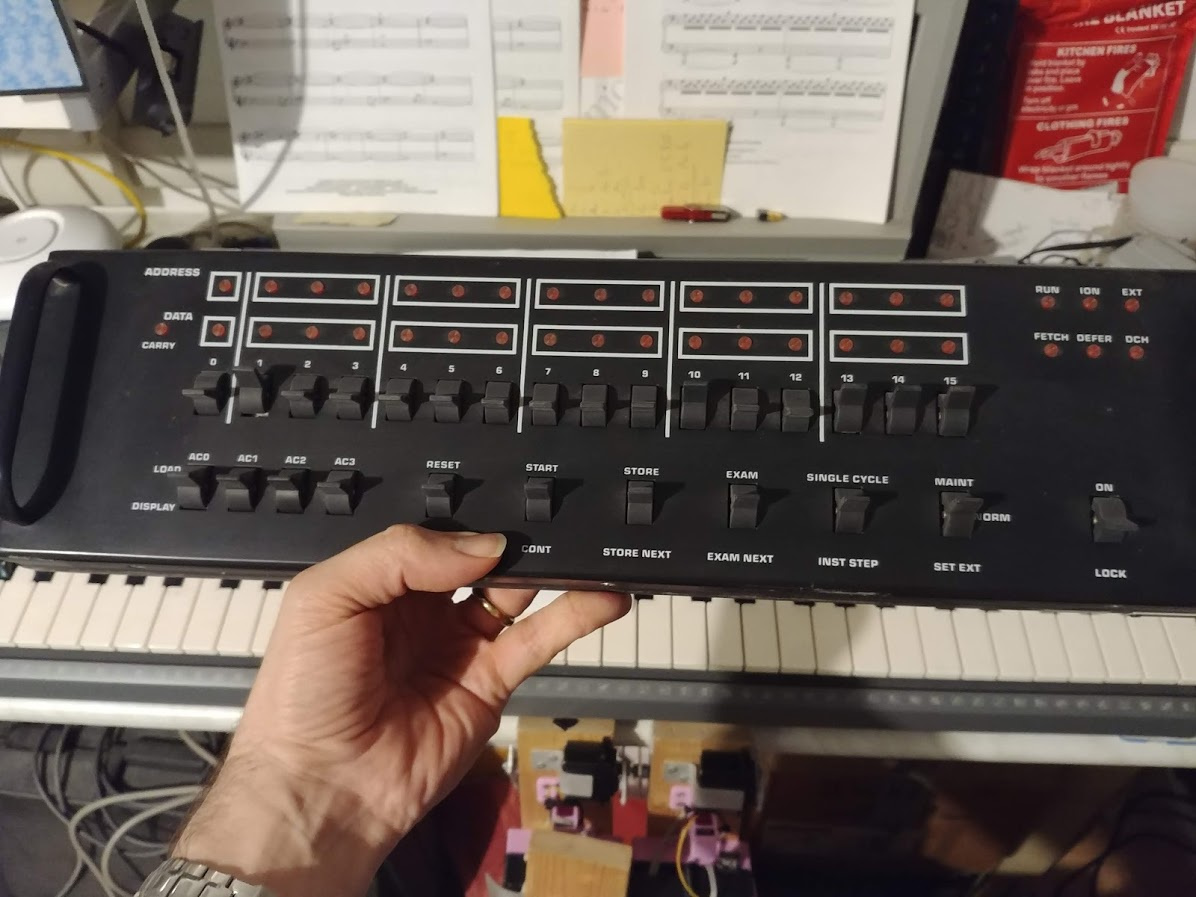
I’ve handcranked a TI 990 with little more interface than that … ![]()
Oohh… such happy memories… I loaded more than once the bootstrapper on our old Honeywell - IIRC- level 6 using the front panel.
And I kept a nice present when a small mainframe was dismissed by one of our old clients…
I2C HWC can handle the switches but not the lamps  One-way traffic at the moment.
Hey 0-15, 16-step sequencer! 
I played with the screen layout code and for a small display (160x128 pixels) the issue is not with the arc controller widgets but with the labels. There is sufficient space for the arcs and they actually work quite well. I increased the topstrap from 1/10 to 1/8 which allows the title to be shown more clearly and increased the font to 10pt. The UI is not much more useful. (Might be a PR on it way for the UI changes.) What doesn’t work well is that controller widget labels wrap when too long, obscuring the value arc. Your layout with bar meter would not resolve this (though it would allow for even smaller screens like wyleu’s ridiculous 64px OLED). Also the dynamic font scaling does’t appeal to me. Having different size fonts for the same UI element looks wrong and the text can end up being too small. I think we need to focus on how best to present the controller label which may best be served by limiting to one line (on smaller displays) and scrolling as necessary.
The topstrap scrolling bounces back and forth which I am not sure about. I did a little hack to my local copy to scroll once which I think I prefer and is what @rockwater suggested but it is disadvantaged by instrument title being prefixed with engine/bank/etc. which potentially pushes the useful bit (the name of the patch) off the screen.
So: I am less critical of the small screen - with some minimal UI rework it may be fine but there is some work to do around text formatting / scrolling. Maybe a task for this weekend…
Let’s not forget, the Korg Poly 800 and Roland MC303 made do with 6 7-segment led displays.
I’m not saying the interfaces aren’t horrible mind.
Hey 0-15, 16-step sequencer!
Hahaha actually laughing out loud 
Okay, I have been thinking on this a bit more. @rockwater’s sketch looks good. The use of bars provides more space for the list which is good for longer text entries. I have found that the title bar probably needs to be full width to allow a useful title length so we could reserve a vertical bar on the right edge between the two horizontal parameter bars for status (audio level, MIDI activity, rec / play status) or we could lose a line of text from the list and place the status horizontally under the title. I think the vertical bar is more space efficient.
I am not sure about reversing the direction of the parameter value bars on the right side (increasing value right to left). I see it looks astetically pleasing (being symmetrically mirrored) but might be less intuitive. We would have to try it out.
What advantage is there in showing the number prefix to the parameter value and what would the number indicate? Is it the MIDI controller number or current parameter value? We could display value only when adjusting. (I have found that overlaying text on a bar can look untidy at small font size and be difficult to read.) Maybe show MIDI controller number only in learn mode.
We could implement a progress animation somewhere. I don’t think it needs to occupy any permanent screen space and can display only when needed. Maybe top right corner within the title bar. (I am weary of a recurring issue where the animation persists so we may want to avoid obscuring anything important.
Careful font selection is required for maximum legibility at minimum font size. I think Liberation Mono font may be the best I have found so far but I have done limited testing and in English language only.
As @wyleu says, designing a small UI means making decisions on what is most important to display and when to display it.
Is it worth considering a modular UI configuration, i.e. the ability to configure which widgets appear where on each screen? Such an approach has a steeper initial design process but would give wider functionality beyond just small screens.
If I were to suggest a priority order I would say.
1/ Status area
2/ Admin
3/ Mixer
4/ Load/Save Snapshot
5/ Engines Parameters
6/ Record/Playback
I’ve been thinking of how to drive from only two encoders, and I reckon you can get away with the top left as mixer audio with back as the switch whilst the other encoder is scroll in list & select on the switch. . . .
It would at least allow you to do a fair subset of the functions from a small box . . .
Roll it into the status? Animated stati (!!?) may be a useful user informer, in very little space.
Seems sensible. In the big screen world on a zynth with acres of space there has been discussion of information display somewhere, and I’ve been wondering about lyrics, so a modular gui opens up these sorts of possibilities.
The other great advantage is orientation. If we have a modular approach which way up the box and any associated encoders are can be accommodated. Most situations seem to involve dodging round cable connections to place the box. Id like to be able to rotate it for different uses and quickly get it looking consistent.
Meanwhile the MorseZynth slouches towards Sandbach to be born…
Ohhhh! It’s so cute … i love it!! ![]()
What do you guys think of this one? Has everything on board (battery, all game-layout buttons, even the tiny speaker):
https://www.waveshare.com/wiki/GamePi15
Can be useful on the Zynthian PiZero project?
It could certainly drive it.
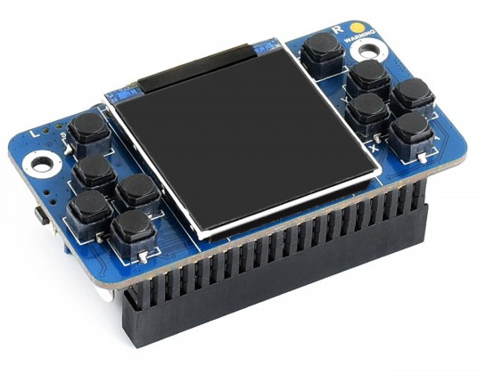
Quite which key you would choose to be encoder up & down and which you might make select is a little moot. It doesn’t offer enough presses to support the full gui, without hideous acts like two key presses for select & back . .
I don’t know if the display is SPI or 12C which might be a problem. And of course unless it’s running as a remote head then you’ve got all the joy of cables in & out. which would probably render it a bit horrible for hand use.
Given my current obsession is MorseZynth now I have a something to really test a GUI !!! a one pixel Screen!!
Who wants to allocate colours … ?
Oh wow. One pixel screen  What a task!

This is the sort of futility I was put on the planet to do . . . ! 
Re. the GamePi15 screen, I guess it’s SPI, according to the config.txt of the recalbox soft.