After adding the App menu, i’ve been rethinking about the UI, specially regarding the suggestion of adding a Main menu … and finally i’ve decided to remove the App menu and add a new Main menu. BTW, I’ve tried to improve the workflow a little bit, but keeping all the essence you already know, without adding extra steps for most of tasks while simplifying when possible. I’m quite satisfied and hope everybody will be too
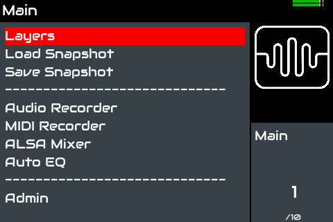
These are the elements for Main menu:
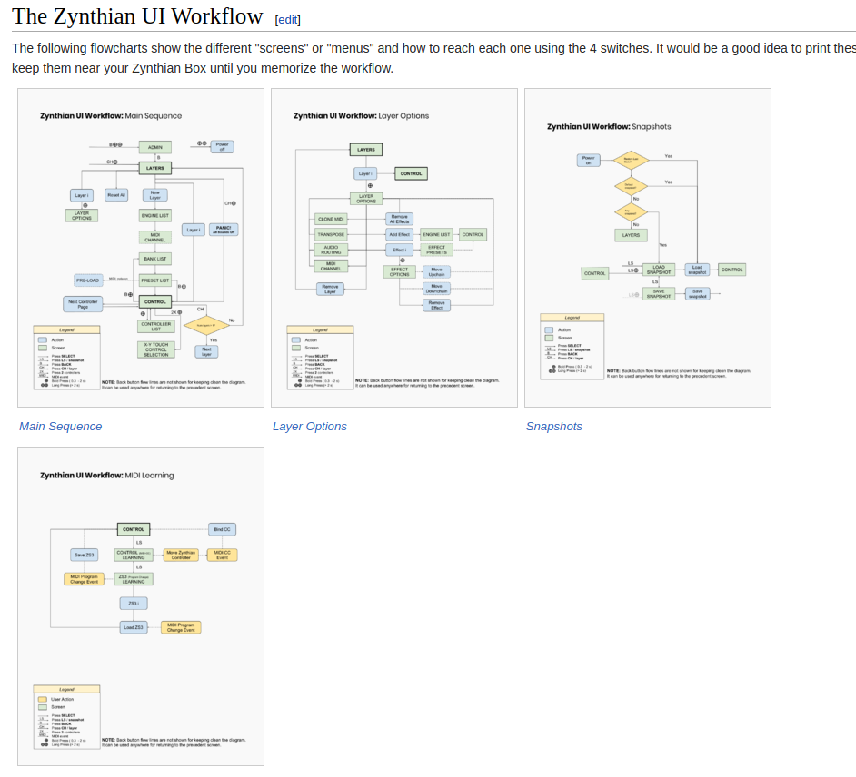
Now i’m updating the Wiki’s User Guide and workflow diagrams ASAP:
I like having the home menu as a landing place. It does feel more intuitive but… may I suggest that the back button not go to admin menu? This was the old behaviour and persists but now we have a dedicated Admin entry in the main / home menu it feels even less intuitive. It is nice to hit “BACK” as many times as you want and end up in a known place. I have always found it a bit irritating that back toggles between home / admin pages.
The back button in zynthian is not a “strict” back … if not when you select a layer from the list and enter control screen, pushing back should take you to layer list again … instead to do preset. If press back again, you go to banks. In fact, i zynthian the back button takes you to the screen preceding the current one in the “Main Sequence”. And the “Main Sequence” is:
Admin → Main → Layers → Bank → Preset → Control
Of course i could remove Admin from the Main Sequence, but then, when you are in Main, what action would you like to associate with “back”?
When loading the snapshot, the active layer when it was saved is restored and shown
Anyway, if enough people thinks it’s better to show the layer list, i have no problem to change. In fact i remember having thought about this in the past, when implementing the snapshots
I suggest having nothing assigned to BACK button from Main screen. This would give an anchor point giving the user s sense of home. It feels more intuitive to me than a continuous journey back and back and…
After thinking deeply about all this, i have a proposal and i hope you like it. I tried to find the best balance between coherence, usability and speed:
With no layers created:
From Main menu, short-back action does nothing
From Main and Layer, short-learn action opens “Load Snapshot”
When some layer has been created:
From Main menu, short-back action jumps to control screen.
From Main and Layer, short-learn action opens “ZS3 learn” screen
I have thought about use-cases.
Regarding the back switch, most of times you access the main menu is from control screen, using “bold-back”. Coming back to control with short-back improves usability and user experience. Also, it has a logical sense: back performs a step-back in the main sequence and when reaching step 0, it jumps to the last step. It’s a cycle. Bold-back does the same, so you never fail. You can see back actions like that:
Short-back goes 1 step-back in the main sequence. When reaching the first step (main), jumps to the last one (control). It’s a back-cycle.
Bold-back:
From any place (most of times, from control) , jumps to First Step of Main sequence (main)
From First Step of Main sequence (main), goes to last one (control)
It’s almost symmetrical
Regarding the short-learn action, i’ve tried to perform the most logical action regarding the context:
If no layers, Load Snapshot.
If some layer:
From Main & Layers: Open ZS3-learn modal. It has sense and I would like to push people to use this feature that other way, it’s quite hidden.
From Banks & Presets: Toggle Favorites view
From Control: CC MIDI-learn
Also, when convenient, short-learn is used to rotate some modals: