Thanks, the buttons take the vertical space now
Agreed, this would be desirable
Thanks, the buttons take the vertical space now
Agreed, this would be desirable
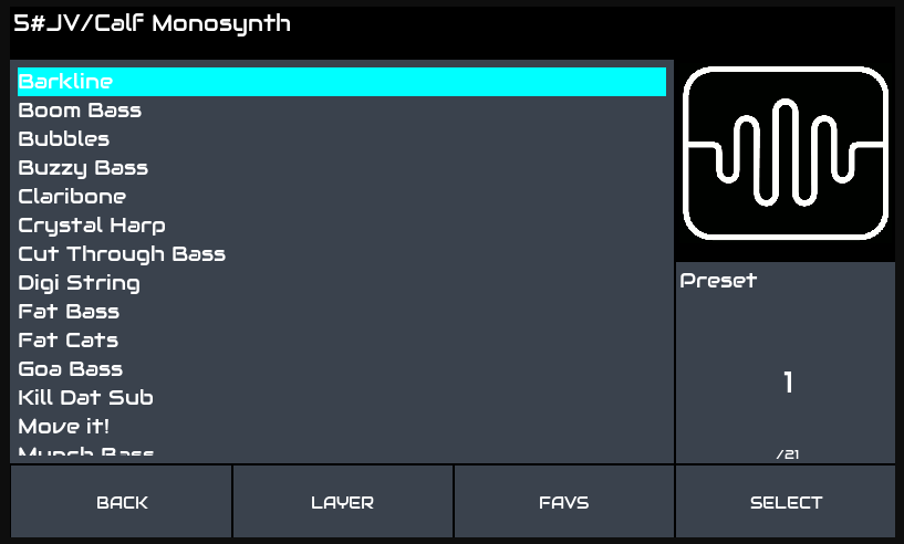
Its cumbersome on my display to swipe. As I said, it’s pita to scroll past visible list items. I would be happy to have it  Could be smaller with icons. Six items will fit nicely I believe. Those cornered ones could be also smaller as hitting corner somehow will survive some finger misalligments.
Swipe gestures are not supported by tkinter. There was some suggestion of looking at another GUI framework that does support gestures but I am not sure that has gone anywhere. Anyway, gestures only really work on capacitive touch screens. Resistive screens tend to require even pressure which is not easy nor natural when swiping. Also, gestures become more awkward on smaller screens. I believe out core goal is to provide a consistent interface for the majority of users with minimal maintenance overhead, concentrating on the official hardware but supporting other hardware where practicable. There are lots of fun things we could do with display x/y/z but I am sure poor @jofemodo doesn’t want the technical debt of a hundred good ideas abandoned by good-willed contributors who’s lives have demanded they move on to other things… (I have been one of those on many projects!!! I have stuck around here for a while though.)
I’ve re-styled a little bit the buttonbar:
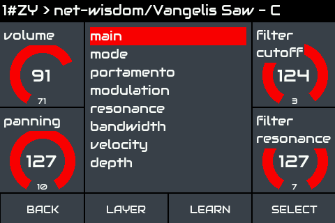
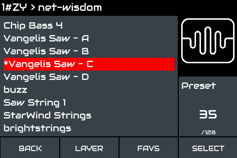
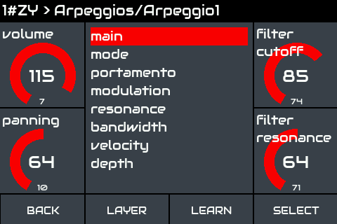
Also, i’ve implemented contextual buttonbar configuration, allowing to change button’s labels for every menu/screen. For instance i used this with the “LEARN” button, so when you are on Bank/Preset screens you will see “FAVS” instead of “LEARN”.
Regarding the more philosophical discussion, i’m not convinced at all of this “patch”, but as it’s un-intrusive, i’ve not problem with merging on master. I’m pretty sure that it will improve encoderless UX.
And of course, we could think about the possibility of configuring the buttons from the webconf if enough people find useful the feature … in fact, this is almost done by simply reassigning the 4 buttons to the extra switches (4,5,6,7) instead of the primary ones (0,1,2,3).
Regards,
Ahhhh! BTW, i’ve fixed the touch-back area on the topbar! @wyleu, i now you will love this tiny fix …
Regards,
It improves a little bit when using transparent-background for text labels:
Regards,
OK @guys! It’s on master now!
Simply update and check “enable touch widgets” from webconf-> Interface -> UI Options.
Enjoy!
For me, tous looks vert nice… and sure, the transparence for Labelle improvise it more than " a little bit"…
Without transparency, the median part of the parameter’s range was hidden… that’such better with transparency…
Works for me!
WOW! This is really something! But please, please, please, add Up/Down too, please.
I’d have to agree with @sailort. Touch-and-drag scrolling is great for synth parameters, but not so great for menu scrolling. We need something more precise than that.
Should we just put them alongside the others in the “touchbar”?
Another idea: also decrease scrolling sensitivity in menus? It would take longer to get to the bottom of the list, but it would be way more precise.
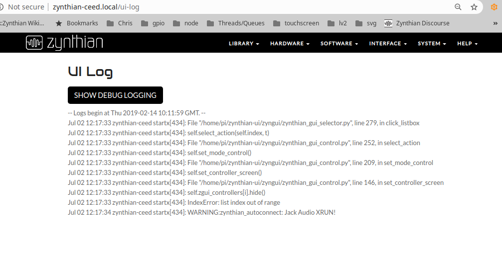
Having trouble running this on an hdmi, which I would control from a mouse to access touch widgets. It’s killed the display stone dead on start up.
This was after switching repo to this branch and back from gui interface.
Working on zynthian-bigtouch.local ( 7" touchscreen)
I would suggest border of the buttons are not in dark grey but hilighted along with the button seperators.
Simply because when viewed off axis the touchscreen buttons become difficult to distinguish.
this is a 3.5" touch screen …
Is there any attempt for Up/Down for selector ongoing? That would be huge improvement for encoderless zynth with 3.5" screens. Please.
Loving having these buttons on my Screen. Thanks for everything.
James.
@Jtunes, have you tried the menus in step sequencer (particularly the feature/stepseq branch rather than master)? These use a different method of scrolling menus with different dynamics. It would be interesting to see whether this gives better, worse or same behaviour to that you experience with the default scroll mechanism.
I prefer the idea of using pop-up control like menus which means there is insignificant impact on screen space and content can be context specific. The menus I added to step sequencer are accessed by touching the topbar, present a BACK button in the top bar and context sensitive options within the menu.
Another feature I developed for step sequencer is a parameter editor which is displayed within the topbar, with up, down, assert and cancel buttons and a display of the parameter and value. This allows adjustment of values with touch / mouse again without impacting screen space significantly.
This is awesome ! Another proof of the constant evolution of the Zynthian, let it be known!
I also found out how to get the SNAPSHOT encoder to bring me to my list of presets immediately; I disabled the midi messages in the admin menu, it’s perfect!