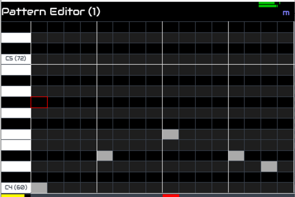
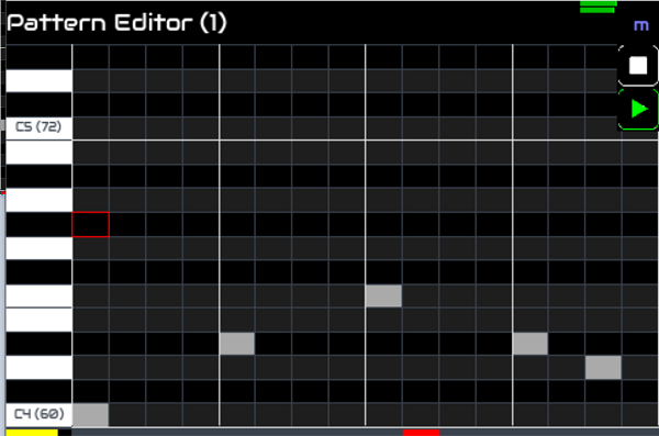
I have spent some time recently designing some improvements to the Zynthian touch interface. My aim is to have a touch interface that allows full and (fairly) intuitive control of Zynthian through touch (or other pointing device) alone without impacting user experience. I have added the concept of a menu appearing in the top left of the screen when the title bar is clicked or when a keyboard or encoder switch is pressed. This allows access to context sensitive configuration without a permanent display addition, i.e. there is no additional GUI element under normal conditions. The menu appears when the title bar is clicked.
I have just done similar for another menu that appears in the top right which may be populated with different contextual elements, e.g. transport control buttons. This allows access to transport control with 2 clicks (one more than optimal but you can leave the transport showing and obscure some of the screen if you desire).
I think this gives pretty good access to a lot of functions.
I think we could have a BACK button in the left of the topbar when the left menu is showing which gives a consistent, simple method to go back with touch:
Touch topbar to show menu
Touch BACK button (above menu) to go BACK
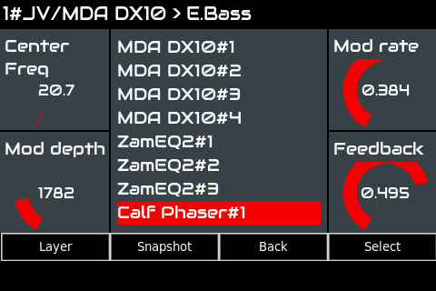
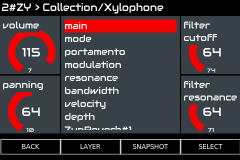
I don’t yet know how we might reproduce the SNAPSHOT, LAYER and SELECT buttons. Maybe these could be in the top right menu. Maybe an extra button in that menu could expand it to show these buttons (but that seems like too many presses). Maybe the top left menu shows all four buttons in the topbar. Maybe we use gestures (though I don’t think gestures work well with resistive touchscreens - maybe very simple gestures might work, like left to right, right to left, up to down, down to up).
I have a 7" capacitive touchscreen which could have quite an interactive touch interface built but this is unlikely to work as well on smaller, resistive touchscreens.
You know, I’ve kinda fallen in love with the idea of a minimalistic Zynthian. Just stack a touchscreen on a Pi, flash the SD card, grab some earbuds, and, Bob’s your uncle, you have a pocket DAW! That said, the touchscreen widgets would definitely help with touch navigation. I think it’s worth thinking through.
Here are (probably not the only) two options:
Give the buttons permanent homes at the edges of the screen. This takes more space, but makes the buttons accessable all the time.
Put the buttons in a collapsible panel or two. This saves screen space, but adds an extra step to the navigation workflow.
I haven’t looked at the workflow diagrams for a while. It may be that many of the workflows don’t actually need permanent buttons and may work quite well with popup buttons / panel.
I’ve also got a 7" capacitive touch screen which would make a nice interface for a minimal hardware zynthian.
For a screen that size I think it would be fine to have permanent buttons showing, why not simply a row of 4 buttons across the bottom, something like:
LAYER | SNAPSHOT | BACK | SELECT
They could be hidden unless the Wiring was set to something like ‘Nothing’
OK, I had a crack at implementing this. The webconf User Interface already has a “Enable Touch Widgets” option, so I used that to toggle whether to show the buttons along the bottom.
Hi @steveb, will you add a screenshot to this topic so we can see what you propose without having to fight with git?
FYI: I was trying to implement as much touch control without interfering with normal user workflow, e.g. by placing them in the title-bar and only showing if user touches screen. I will have a look at what you have done and comment .
I just created a new development branch on the zynthian repo and merged the branch from @steveb, so now, everybody can test the steve’s proposal easily by changing the active branch from the webconf.
The new development branch is called: steveb_buttonbar
There is a python error, “NameError: name ‘datetime’ is not defined” when clicking a button.
The buttons are rather small (vertically) but as @jofemodo mentioned, the screen vertical size is not correctly calculated so this may be okay after that issue is resolved.
I would prefer we design the interface to align with touch / mouse workflows rather than just add the four buttons which does not deal with the four rotary encoders. An example of workflow based design is the mixer I am working on which allows direct control of the gain, balance and mute of the selected channel and change of selection using encoders / switches whilst allowing direct control of any channel’s gain and mute with touch / mouse, having a pop-up for balance. Each interface is then optimised for the user workflow based on available input method. (I do similar in the step sequencer.) I am worried that precious screen may be occupied by buttons that may not even be relevant to that screen. Also, there may already be a touch / mouse workflow on some screens which may make the buttons redundant. I also worry that we may need to modify code to support the buttons which is yet another overhead to code maintenance. Sorry for sounding negative but it is worth sharing concerns alongside compliments .
If we do have buttons, maybe they could be combined with the top bar somehow to reduce screen usage or only appear when relevant.
To be clear, the use case for these buttons is for minimal zynthians with no encoders or switches. The buttons will only appear when “Enable Touch Widgets” is checked in the web-ui, and I don’t think it would be appropriate to ever make that enabled by default.
For minimal zynthians I think its justifiable for there to always have buttons present, as they are the virtual equivalent of switches. And having them at the bottom makes sense for a touch interface so your hand isn’t covering screen content to get to them (like the main action buttons on a phone).
The touchscreen interface already has alternatives to the encoders, so its only the buttons we’re missing. The money saved on encoders and IO board can be put into a bigger screen, which makes the loss of screen real-estate less of a concern.
One reactive UI future enhancement which would be nice is changing the labels and hiding the buttons based on the screen context, but that can be done later.
It’s required in pure touch world’s like the 3.5" screen community, because you can get into logical traps like no back button ( the title bar trick) in long layer names.
The zynth & yeti mic combo needs something like this for the disinterested operator… ("Stephanie, can you start and stop the recorder for this next peel . . ? ")
There is a great rate of progress at the moment and we have a lot of new GUI interface options and it’s important that we don’t loose any basic functionality, and provide as standardized a response as we can. So that the disinterested operator feels at home with the tools we offer.
I agree about finger shadowing, we should consider that so perhaps we could consider that being an available 4 function selection opportunity.
I have committed a couple of fixes to the branch to fix button height and press timer. I played with it a bit and am not yet convinced it is the best solution, especially as the button labels don’t necessarily portray their action (as described by @steveb above who suggests a future enhancement to make them context sensitive). I also note that only screens derived from the base class will inherit the buttons. That probably makes sense but not all screens may have been ported to use this base class. Also the buttons are set to row 3 of the grid which means all child panels must exist in rows 1 & 2. This may be fine if we ensure all child panels instigate their own background frame. (If we hit problems we could always make the button row higher - tkinter ignores empty rows.)
The button timers could be improved to give similar behaviour to buttons, i.e. long press should trigger without letting go of button.
Wow, This is exactly what I was thinking that is missing from UI when one has no encoders. Any chance to add Home button and Up/Down buttons also for navigating middle list panel? Those doesn’t need to be such wide, of course. Touching, holding and dragging past visible items is real PITA. And while I’m here, any future plans for change those circular values indicators for something different, squary maybe, High contrastish, something like progress bar in rectangular frame? Will save a lot of space on screen. Looking forward to continue my zynthian fiddlings with this new UI enhancements. How to get this on my zynth?
Edit: I’ve reread this thread, and if timed buttons are possible, Home/Back could reside on single button (Home on long press).
I would rather the list widget behave like ubiquitous phone interfaces, so that swiping up scrolls down with gradually reducing momentum. I don’t know if tkinter supports this natively.

 .
.