There’s some discussion a while back about icons and how we arrived at the current set: Improving UI: contextual help everywhere! - #31 by jofemodo
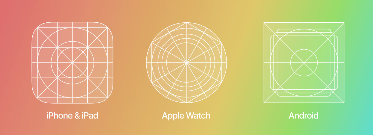
It’s a bit of art and science keeping everything spaced and balanced nicely. Ideally every icon should have a minimum boundary zone with only minimal parts extending into the space. I setup a grid and had a couple of passes at some specific types which were extended further. The icons that are mostly square, rectangular or circular should ideally adhere to the grid with an empty boundary space for breathing room. It’s the irregular ones that are tricky, like the midi text combined with another icon in one object.
It’s something I’d still like to go back and revisit.
Here’s the grids for apple/android icons for example: