Hi, guys! I just uploaded some screenshots of the zynpad icons.
As a general rule, those of you who have been using the sequencer and are used to the old ones, will have a harder time accepting the new ones.
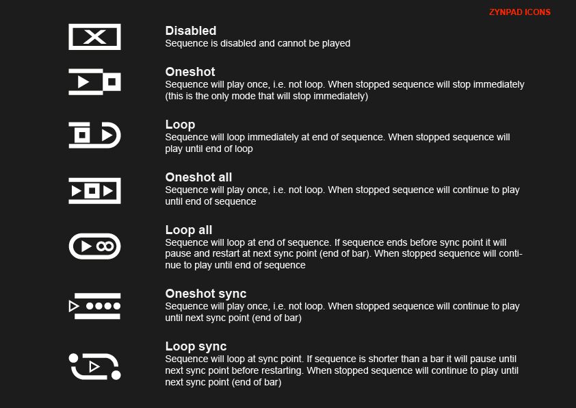
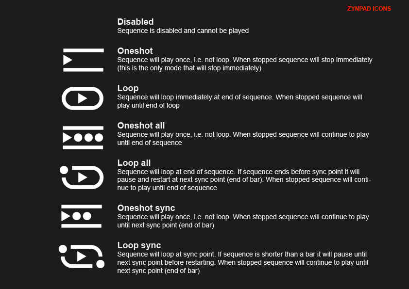
That is why my suggestion is that you evaluate them based on chart 1, that is, the graph of the new icons next to the description of their function.
In general, I think they are more descriptive and easy to remember than the previous ones.
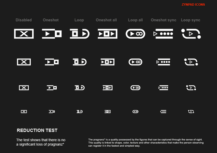
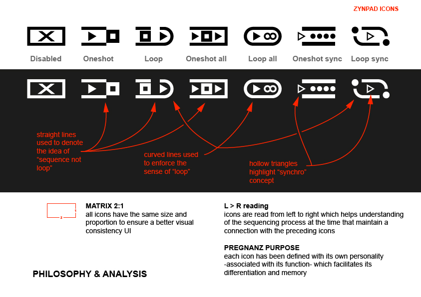
I have also used certain conventions as indicated in chart 3, which establish relationships between them, to facilitate the differentiation among sequences, loops and sync
Hi again @riban !
Suppose that you have seen the uploaded zip with a vector file in pdf containing all.
Anyhow tell me the most suitable format for you (vector or bitmap) and I upload each one separately
I’ve reworked a little bit your proposal, taking the more elegant & essential elements, but simplifying/unifying the “graphic language” to get a more coherent icons set. Tell me what do you think.
Thanks for trying!
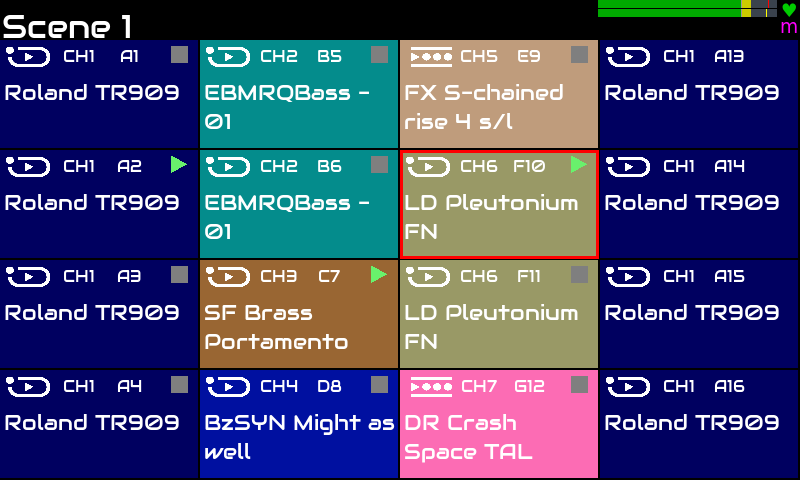
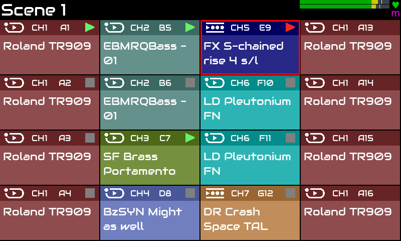
Proposed screen was based on desaturated colors which are ideal to support white text over. Would you need a more complex color palette to test? In that case please indicate number or colors to generate.
The superimposed band of the top, personally think clarifies the information.
I must say that I´m happy to contribute to zynthian project
Your contribution is being really profitable and has a great impact. All zynthianers will enjoy a nicer UI, what implies a better UX. Happier users are very good for the project.
After generating the 16 colors, perhaps you want to think about the mixer screen, control screen and “selector” screens (menus). Same approach. We want to keep the current layout and workflow, but improve the look.: colors, spacing, etc
Smaller changes with the greatest impact in UX.
I know a big refactorization of the GUI is very tempting, but now is not the moment yet.
Thank you @jofemodo!
Please find the uploaded 16 colors chart. As I told you is based on desaturated colors, good for reading white text over background. At the same time, provides a more pleasant to the eyes experience