Hi, again.
Should be good for me, some screenshot of “you want to think about the mixer screen, control screen and “selector” screens (menus). Same approach.” to facilitate my approach.
Thanks
1 Like
Hi @erasmo !
There are too similar colors in this palette, specially in the “blue” zone. We need the colors are as different as possible. Perhaps not all of them can be “so desaturated”. Think in the use-case, when you are using the zynpad in a live performance and you don’t want to make an error. GUI aesthetics are important, but it’s not the most important.
Thanks!
2 Likes
Hi @jofemodo!
Please, take a look to the new palette uploaded.
However, I want to share some color insights with you. Some probably you know, but anyhow, are important to maintain a similar approach to the question.
Color spectrum is composed by only 7 colors. When in RGB mode, we can reach 16777216 different colors. But –here is a meaning detail– when say different, that really comes to say that majority are similar, though our eyes (but not the eyes of all) can diferentiate their tints or shades.
Bearing this in mind, at the time of design a product color palette of more than 7 colors, from the very first moment we know that we are going to look for a compromise. That compromise will come determined in first instance, for the use and media. In our case, a user interface of a digital music swiss army knife.
Until know zynthian palette had colors very different among, BUT, that had a cost.
Such differences came from the hand of very intense contrast and different weights in terms of color perception among swatches.
When I sent you the first palette exercise, the color impact of the swatches had been softened to give them all, a relative same importance. That kind of focusing gives the user a more comfort reading without distractions when trying to decipher in a matrix of 4x4, if one color cell is “more important than others” (intentionally or unintentionally) with a color palette that maintains different color weights.
As far as I guess, all the cells and their functions, have the same relative importance.
I supposed than this approach of mine is what liked you of my first exercise. So when submitting the previous 16 color palette, I had 2 clear objectives:
• First) getting colors suitable to allow white texts over, enabling easy reading.
• Second) getting an interaction among swatches in the way that no one had more impact -or importance associated to color- over the rest.
IMHO both premises were achieved. Moreover I should recommend to give a try and see how performs.
Nevertheless I know that color is question of tastes, so I am sending you this second palette.
I must say that here the differences are more abrupt. If you should need even a more abrupt difference, then probably I shouldn´t be the ideal performer ![]()
Zynpad 16-colors-paletteB.pdf (301.6 KB)
3 Likes
Hi @erasmo ![]()
I know what you mean, when it comes to perceptual values of colour symbols, and their entailed semantics.
I am myself quite proclive to the poetry of desaturated colours, for their XX-century avantgarde resonances and calming character, undeniably linked to the softer energetic content of the matte colours’ radiation.
I also understand that there are fairly (and completely legitimate on their own) contrasting conceptions, about what conveys either modern elegance and postmodern sophistication or dynamic sense of contemporary and comunicative effectiveness, regarding chromatic palettes and related contrast schemes.
As a long-time user of 1990s Japanese black boxes - be it rack synthesisers or stereo equipment components - I must say that I feel quite fed, by now, of stark contrasting relationships in colour, between pitch dark and something else, but this sensitivity - as you and @jofemodo justly point out - is very personal and very cultural.
The world, in its unquenchable diversity, is certainly a beautiful place!
1 Like
Would’nt it be nice to theme/skin the UI: colors/fonts/pictos (and share them)? I know that this is already asked begin 2021, But since the team is rethinking the UI, This is the perfect moment for this?
1 Like
Hello @Aethermind,
I agree mostly with your perception but, besides the colour discourse, we cannot loose focus on the colour applications. And yes, is a world of subjectivity, fashion and trends, too.
I think that the paramount significance in the zynpad colours is the fact of the same relative importance among cells. I look at this as a non written mandatory: all the palette colours MUST resemble a same relative perceptional weight when talking about choosing right colours.
So when selecting a palette is crossed with the needs and use of that colour palette, the selection gets narrower.
In that sense, my ideal palette (first submitted) should share a similar perception on saturation and hue. Not as a matter of taste, elegance or so on. A matter of readability and comprehension avoiding unnecessary distractions. But, hey! that is my particular approach.
Other people are able to think than their right colours are brilliant; or pastel or a mix, even compromising perception. And it´s fine. But not for me.
I think that you´ll agree when I say: I did my best, I cannot do anything better. So if you dislike my work, or do not find it suitable for your needs, the solution is beyond me. You´ll have to look for, in another place. Is not a matter of adequate my vision to yours or vice-versa. I have a strong background in design, communications and art, and at this moment the less I can keep is a clear point of view. Not for everybody? Sure!
I realize that this project has a lot of people in love with it, something fantastic. Many of them reluctant to changes. I have nothing to say. I respect it.
Totally right: “The world, in its unquenchable diversity, is certainly a beautiful place!” ![]()
2 Likes
I don’t think there are many (any?) of us who don’t want change but there are some (many?) who understand that change is expensive and that with limited resources we must manage change carefully to avoid unsustainable effort. As our lovely leader says, small steps.
Regai colours, we are now quite far from this pallet I originally designed that had the following criteria:
- Each colour to be as distinctive (different to others) as possible
- High contrast between text and background to support accessibility (visibility)
- High degree of grey difference between colours to support accessibility (colour perception deficiency)
- Light text on dark background to improve readability (according to ergonomic design principles)
- Attractive colour selection (subjective and influenced by current trends and fashions)
- Minimal quantity of colours to reduce garishness
As you can see, these criteria are someone’s conflicting. I have worked a lot in the field of technology accessibility and feel a duty to improve access to all technology I work on to as wide an audience as possible.
I am not in charge of the UI of this project and my skills in this area may be questioned by some but I think it useful to share my experience and a bit of history which may help inform you all. There is a place for beautiful things and a place for functional things and we would love to hit the sweet-point of both.
Regarding skins, that would be cool but requires much effort. Maybe it could be considered in a future UI change.
2 Likes
sounds like we need zynthian skinning…
2 Likes
Hi zinthianers, as designer this seems a nice challenge, I want to underline that maybe would be more appropriate, respecting the layout of the zinthian 4.x, to reduce the screen layout usable, because finger and touch pen can barely control UI around display border. If someone can provide as well display sizes, the interface could improve massively in term of usability.
Another topic could be the use maybe of a simplest font, in order to improve visibility.
And maybe enlarge all the icon increasing pages number.
I support the motion! ![]()
-
Each colour to be as distinctive (different to others) as possible
WHY? Which is the real need that support this, if such colours are defining actions of same relative importance?
I believe that this is the statement that make different, yours and mine approach -
High contrast between text and background to support accessibility (visibility)
I AGREE. -
High degree of grey difference between colours to support accessibility (colour perception deficiency)
I AGREE. -
Light text on dark background to improve readability (according to ergonomic design principles)
I AGREE while making small step changes; but this criterium –from my point of view–, can be opposed by others with a similar degree of validity -
Attractive colour selection (subjective and influenced by current trends and fashions)
I AGREE though we are facing the arena of personal tastes -
Minimal quantity of colours to reduce garishness**
Well: are not we defining a 16 colours matrix? It seems that the quantity of colours is predetermined.
Garishness, then, may be a subjective consequence of wrong choices.
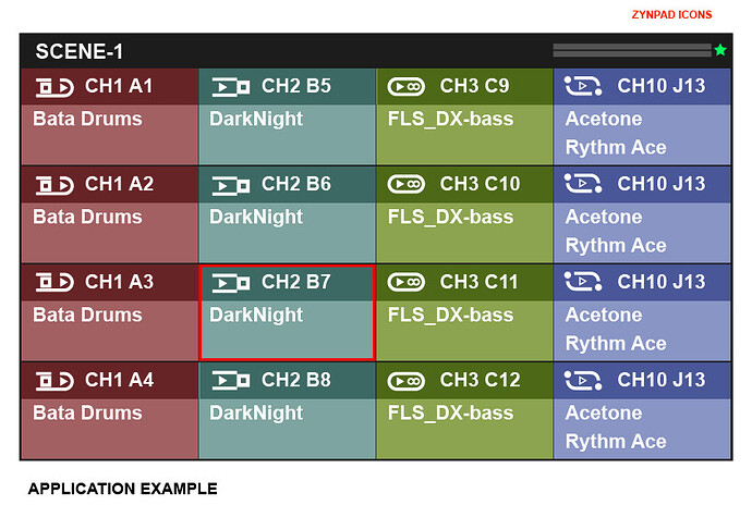
Having this in mind, when I submitted the initial rough idea of zynpad, you could appreciate how icons and channel were separated for a colour darker strip. But, please, observe than that strip was the SAME colour of the cell, multiplying over itself, precisely to not add more colours. I particularly think that such strip, get a positive impact introducing levels of reading, for faster understanding and navigation, but again, this is solely my particular thinking
[/quote]
3 Likes
This criteria (which I listed at the top as it was high priority to me at the time) is to allow a user to very quickly differentiate between the mutually exclusive groups. When you press a pad in a group you will affect any currently playing sequence in that group hence you want to know which relate to each other. If there are subtle differences then you may think a pad will affect another when it does not or (less likely) vice versa.
1 Like
I see. I asked at first which kind of dependencies could be established through colour. I did not receive any guidance, so my conclusion was that all had the same significance.
Anyway @riban, this is not any kind of personal conflict with you.
I have made my contribution with the best of intentions and the greatest of reasoning.
Dedicate time to collaborate in the Zynthian project for me is positive and enriching.
However, having to spend time defending my contribution I see as a meaningless waste of time. I’m not going to try to convince anyone. If you don’t like it, I understand
2 Likes
Yikes! You don’t need to defend anything. No one is attacking! I added some context around some of the initial design concepts to support the discussion here. I’m really pleased with your contributions. It’s good to have a bigger picture.
3 Likes
That´s fine for me!
1 Like
Hands down, that is very aesthetically pleasing. Much more readable and clean. Only if zynthian will support custom UI themes in the future, which will probably be a nightmare to implement.
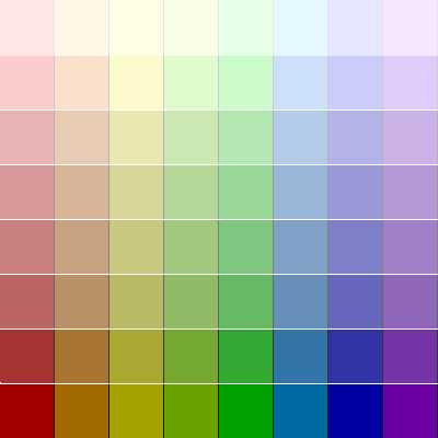
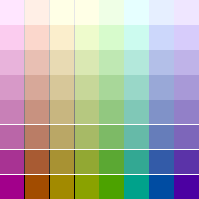
Pardon my delayed post. I read a lot, but don’t always sign in. I’m a graphic dinosaur, so I took the liberty of building a couple of palettes. Palette 1 has 16 colors equally spaced of the Hue circle (22.5 degrees); Palette 2 shifts these colors by half (11.25 degrees). Note that the Green remains the same. The zip file contains GIMP Palette files in RGB, and text files in Hex, as well as the png files. GIMP xcf files are not included (they are large), but available if you wish.
ZynthianPalettesEtc.zip (13.8 KB)
2 Likes
Resurecting this thread because it seems the right place to discuss graphical layout ideas and concepts. When @erasmo started this thread he was suggesting a more icon type UI. That could work quite nicely with a touch interface - maybe providng more benefit than some of the on-screen button ideas we have recently discussed. If we look at his ideas for icons to navigate we can see that there could be an option to replace some menus with grids of icons. (They are effectively the same thing.)
But what I wanted to discuss was the idea of laying out the chain as a grid of blocks, each block representing a processor with vertically aligned processors being in parallel and horizontal axis representing series processors. I wonder whether such a view might work in the processor options menu, maybe occupying half the screen whilst the menu list occupies the other half?
5 Likes
Do we have wireframes of original zynthian screens that we can use for this discussion?
If not, maybe it is a time to create one. Do we have preference for opensource tool that could be used for wireframe drafting.
IMO wireframes are important to agree on first before going into detailed graphical design.
Kind of… We have this navigation plan from previous version:

This was derived from this:
Zynthian Navigation.drawio.pdf (117.2 KB)
Zynthian Navigation.drawio (4.9 KB)
which is drawn with draw.io (which is now called diagrams.net) and derived from this spreadsheet:
Zynthian Navigation Map.ods (21.5 KB).
We were using these as our wireframe but they may have become outdated. Each release we test the navigation and may have manually changed things to work as expected and maybe not updated the wireframes (which is the wrong thing to do - I know). This was in old docs but it wasn’t particularly easy to comprehend so we moved to the screenshots with button action icons in a bid to simplify the user docs.
I have used draw.io (now diagrams.net) as a free, online tool. It may not be opensource but it is freely available and accessible.
We need to consider different navigation mechanism: touch, encoders + switches, buttons.