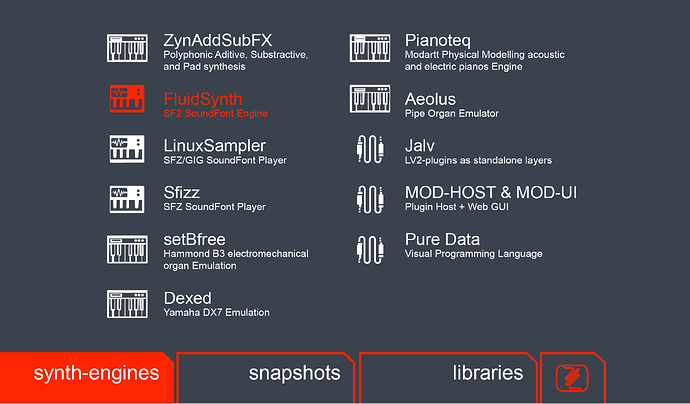
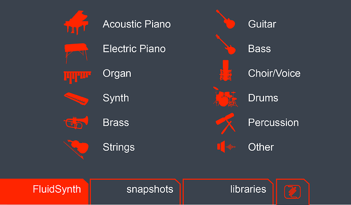
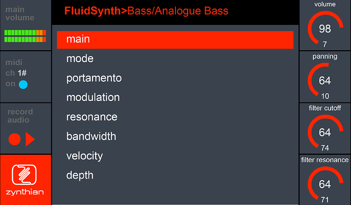
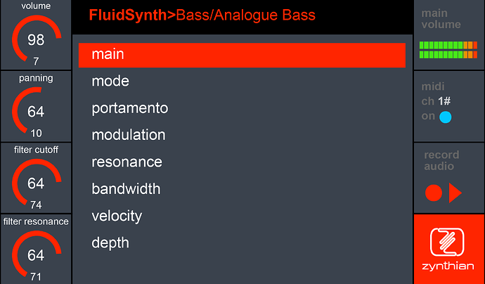
Time for a graphic UI & UX?

Hi, guys!

I don’t exactly have enough time, but this project is so incredible that I have dedicated a little effort this weekend to contribute to the extent of my possibilities.

That means working within my design competencies. :wink: From the first moment I saw the ZYNTHIAN logo I thought the wave could perfectly have the shape of a Z.
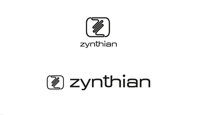
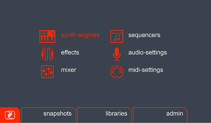
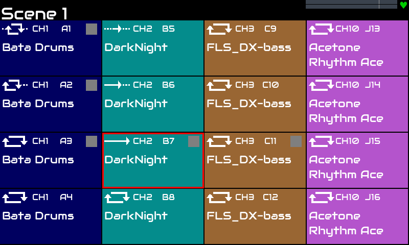
From there I have developed some ideas to provide the interface with faster and more visual access. I hope you like the attached screenshots and that, in some way, stimulate new ideas

In the instrument view, the total room is distributed to give more visual importance to some items until now a bit hidden, while maintaining a proportional space and ease of reading.

At last, one consideration of mine. With respect to the V5 and future developments, personally I think that from a dexter person point of view, the knobs should be placed on left of the screen. Why? Because for a dexter person manipulate a knob is easily done with left hand, reserving the right hand to touch with more precision the screen. Don´t you agree? Hope it helps!

9 Likes

But what would I do with my Zynthian brand?

You have made some very attractive artwork. There are a few things that may be challenging, e.g.

  • Scalability / maintenance overhead - each instrument / bank / preset may require an icon (allocation). This is a significant piece of work. There are thousands of them.
  • Compatibility - most people don’t currently use a touchscreen much. Versions up to V4 have a fairly small, resistive touchscreen that needs a stylus to work effectively. Many people customise their devices to have different physical interface, e.g. no touch, no screen, no encoders, no buttons, extra buttons… They do so within the bounds of the provided functionality but it is challenging to maintain workflows for such a variety of interfaces. We try to ensure that everything can be done from 4 encoder/switches alone and from touch alone.
  • Left vs Right is a hot topic. We have had that discussion (argument?) and left was chosen for reasons not dissimilar to the argument you give. As a right handed person with good left hand (not quite ambidextrous) ability I prefer the knobs on the left where I can adjust with my left hand without obscuring the screen but a choice needed to be made and it was!
  • I am not following the tabs along the bottom. How would you suggest they be triggered? Touch?
1 Like

Hi @riban !

I must state some considerations before answering.
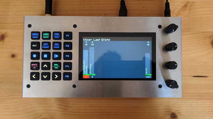
The natural tendency IMHO is growing towards bigger screen sizes. In the super attractive V5 model protoype, this is a reality.

7d8fda08ed74881df329ac3a8e311050dd411390_2_690x388

Bigger screen sizes bring the user a higher level of interaction doing life easier.
So, in an imminent future, there will be old zynthian boxes with tiny screen living together new ones with higher screens. But, in a more distant future –at least as I see it– the zynthian box will be based on a big touch screen.

In this way, the idea behind all the design proposal is a touch screen, say at least 7", but ideally I should consider as best 10 or even 12".

Now i´ll try to answer you.

• “Scalability. …preset may require an icon”.
Well, I think that icons must play a role. Based on other instruments all we know, icons usually have a clarifying role to give visual approach. However, icons cannot mean everything.
I. e. is more comprehensive saying “stacatto piano recorded on a tub bath” instead of a hard to decipher whatever picture. The screenshots give a rough idea of the role played by icons as introductory tools on first stages of zynthian interface. Hope this helps to clarify .

• “Compatibility - most people don’t currently y use a touchscreen much.”
Totally agree with you. But that is the nowadays picture. I am thinking in the future. Enabling a visual UX&UI requires time and hard work I guess.

• "Left vs Right is a hot topic. "
Of course. I have read about interesting posts. Simply, I put my opinion on the subject.

• “I am not following the tabs along the bottom. How would you suggest they be triggered? Touch?”
Yes, indeed they supposedly are touch tabs. As other tabs frequently found on UI´s. Is an obvious consequence of all the previous statements.

•“But what would I do with my Zynthian brand?”
Zynthian brand is perfect. But in the same way that Zynthian project is evolving all the time, I think that may be of interest considering that brand may evolve as the project does itself.

1 Like

hi @erasmo,

  • first the logo: I do prefer the existing one, with its sin wave look.

  • then the mockups (I suppose You didn’t develop software side anything in that direction):
    Like @riban, I think, they could be accurate on a wider touch screen then the actual 3.5 inch SPI display.
    With physical encoders and push button it’s easy to progamm shortcuts so that the Zynthian box fits perfectly to your needs. And it’s important to keep this versatility. So first mockups looks in redundancy.
    I really love the Fluid SYnth instrument select and parameters views.

Hi @le51 !

I have developed some UX and UI, but the really important here is that my vision is not compatible with the actual state of the art in zynthian, with a cloud of users with valid zynthian boxes relying on tiny screens. Is a futuristic approach.

You must think of it as a brainstorming, nor a finished or immediate artwork: “I hope you like the attached screenshots and that, in some way, stimulate new ideas”

1 Like

Let me jump in the discussion!

In an ideal situation, zynthian could be completely controlled with CUIA.

The user interface could be separate from the core functionality and we could even have different UIs to choose from, depending on your needs.

So IMHO it seems a good idea to discuss an improved UI that could be used in configurations that we don’t have now but that could arise if zynthian becomes fully remotely controlable using CUIA.

I like the idea of icons and short explanations of the engines, the smooth the steep learning curve.

Anyway, thanks for your beautiful effort! @erasmo , I looks great :heart_eyes:

@pau The user interface could be separate from the core functionality and we could even have different UIs to choose from, depending on your needs.

That should be wonderful !

Hi Erasmo,

Having a background in design, I must say that your speculative UI artwork is very clever, and generally elegant in layout balance, icon shapes and lettering.

I like the idea of differentiating visually the typology of plugins (synthesisers, samplers, drum machines, generative algorithms, fx), and also your attempt (not necessarily agreed upon by the usually for-the initiated-inclined Linux folks) to clarify the Zynthian’s functions in a more intuitive and mainstream fashion.

Of course, Riban’s remarks on universal functionality and screen scalability are reasonable, and I think that their logic comes from long debated subjects in the Zynthian’s development circle.

UI concept: I concur that, with most custom builds embedding a larger video matrix, the long term trend should be to conceive and design a larger and more convenient user interface real estate.

I guess that the Riban’s reservations depend mostly on the potential workload strain of - say - designing and maintaining two or three selectable arrangements of the UI layout, on the forces of a rather small development team.

Touch-based workflow: I do not believe that there is a general consensus yet, regarding the actual operability of an interface navigation style based exclusively on stylus/finger pointing. I haven’t had the pleasure of exploring the functionality of one of the latest top-range Waldorf synthesizers (not to mention the marvelous but unattainable Moog One), which sport luxurious large-scale color LED displays, but it seems that programming their engine entails a varied mixture of panel controls and touch-screen operation.

In my personal experience - mostly with music notation programs, CAD and multi-channel DAWs - I have come to dislike strongly pure mouse pointing or pure stylus/touch functionality. I think that they cause significant fatigue for eyesight, muscles and tendons. Conversely, I feel that the mixed operability devised by the Zynthian staff, based on a combination of encoders and screen pointing, is a good compromise between different approaches: in a sense, the best of both worlds!

Ideally, my interface design of choice comprises both touch operation, for page navigation and function selection, and encoders/potentiometers, for parameter setting and item selection.

2 Likes

Hi, @Aethermind !

I agree mostly with you. Furthermore, your insights are giving me the opportunity to explain more precisely the design idea proposal. Perhaps was not able to state it clearly from the beginning. I was not asking for a revolution nor an evolution.

The design proposal never had the idea behind of substitute encoders or touch buttons for a touch screen. At the moment, I am working in my own Zynthian box. I must say that initially I bought a 7" tactile screen to make a button-less Zynthian. Such idea, needed a few testing hours to acknowledge that, without encoders, the navigation through screens was significantly slow loosing interoperability.

Moreover, I asked for help in my previous post “encoders made easy?” to implement encoders easily.
Now I am working in my own Zynthian box design.I will show the process when finished, and of course, some music too.

So, when I submitted my “brainstorming design proposal”, I had several clear ideas on my mind:

  • First, actually many users have invested in Zynthian boxes with tiny screens. They need and deserve maintain functionality on their machines, probably forever. I do not see Zynthian project making a jump towards a tactile UI, isolating such cloud of loyal users.

  • Second, the cost on tactile screens gets lower every year. I see this as an opportunity to promote more comfortable and visual UI.
    IMHO this will be the fact in a few years. Anyhow, I must say that (what I have tested) a 7" screen is small yet to get a tactile UI solely on Zynthian box. So I speak in any moment to go for bigger screens 10, 12…, even higher. But please, understand that I am speaking of future as a bit diffuse concept.

  • Third, I think that the V5 Zynthian protoype states clear and cleverly the pathway. I love it! With a V5 in mind I thought that a more appealing visual approach was possible.

  • Forth, If it was possible, what @pau said: " The user interface could be separate from the core functionality and we could even have different UIs to choose from, depending on your needs" for me should be –simply perfect–.
    A Zynthian step forward, setting the basis of UI for the next (years in mind) Zynthian to come.

  • Final thought, I want to suppose than many of the actual Zynthian users with tiny screen boxes should love to move, on a future, towards a Zynthian style V5 with it´s more visual attractive and comfortable UI. Don´t you?
    Is up to the development team to pave the way :wink:

1 Like

I personally never use the touch screen, probably because of my particular use case, but I presume that when you are using the mixer and sequences it makes things much easier…

I think that encoders are fine and necessary. One thing I would particularly like is that I could use any MIDI controller’s encoders to do the same job. The same applies to buttons and faders.

So I would decouple navigation in the interface and allow some kind of remote control or mapping to an external device. You could have any controller you could think of to control your zynthian :slight_smile:

Hi @erasmo !

Thanks for your proposals. They are really interesting and don’t doubt they will serve their purpose of seeding ideas and UI concepts for future development. It’s clear that touch screen is becoming more important in the near future, but we don’t have plans for deprecating the knobs. We want the best of the 2 worlds :wink:

Regarding your design skills, i have a very simple task for you, if you want to contribute with something much less ambitious, but much more snappy. Could you try to improve the zynpad’s “mode” icons?

The current ones in testing branch are like this:

as you can see, they are not very nice and for sure, they can be improved a lot.

This zip contains the 6 current icons:

zynpad_mode_icons.zip (31.9 KB)

If you could provide a replacement of similar size and weight, but nicer, i’m pretty sure you would earn the love from all the @zynthianers using the stepsq, and probably will save some retinas from the hell of having to see these ugly icons for hours :nerd_face:

Thanks!

2 Likes

Regarding the logo proposal, we had a similar proposal from the designer that designed the zynthian logo, back in 2016. Look at this:

FYI, Mr. Filo, the designer and friend of mine, proposed more than 40 logos. It was a long process but i must say i’m really happy with the one i choose :wink:

Just to remember, i will show a few more:

Ohhh! Yes … there were a few nice logos!! And Filo almost kills me :sweat_smile:

Regards,

2 Likes

Hi, @jofemodo !

A pleasure contribute with a bit, to this fascinating project.
Again I say that never intended deprecating the knobs :smile:. I am aware that even with the most comfortable touch screen, they will make a faster UI experience. Sure of that.

I will do my best with the zynpad´s mode icons. I will look for a more intuitive and appealing approach.

Regarding the logo, I do not doubt of a tough creation job. Developing a brand is hard.

We´re in contact. Along this week I will show you something.

1 Like

Something simple that fits current style, please. We don’t want to remake the zynpad layout. We simply want to improve a little bit the mode icons. One tiny step in the right direction. We use to improve in tiny steps :wink:

Thanks a lot!

1 Like

Fine.
I should need a light explanation about the function of each one.
I have not used yet the sequencer.
Should I have to constrain to size and/or actual proportions?

1 Like

Thanks @erasmo! There is a description of each sequence mode in the wiki. The icons in the wiki are the current stable, not the ones that @jofemodo has updated recently but that doesn’t matter. You are kindly looking at the mode description and crafting a suitable icon.

Cheers

1 Like

Hi @riban!

That´s perfect. Do all the icons have to have the same size or proportion?

Yes, they fit into the same space so should have a consistent size. If it makes sense for some to be smaller than so-be-it. We do scale the icons to fit the space on each screen resolution but that comes with its own issues like scaling artifacts. I guess higher resolution has the capacity to be scaled more accurately but can lead to designers adding too much detail that is either lost or corrupts during scaling.

BTW - I was very tempted to start implementing some of your design ideas but have controlled myself - as @jofemodo says, incremental steps - and we have a lot of work to do on other things right now.

1 Like

Well. I see.
This kind of job I use to do it with a base-grid. I will try then to maintain size and proportion in all cases, to avoid independent scaling to ensure visual consistency.

" BTW - I was very tempted to start implementing some of your design ideas but have controlled myself - as @jofemodo says, incremental steps - and we have a lot of work to do on other things right now." :rofl:

1 Like