The current implementation of clock, transport, sync, tempo, etc. is a bit odd and flawed. We abuse the jack transport in ways we shouldn’t. I have spent the past few days working on this and it will be much better soon. I am currently fighting with MIDI clock (and it seems to be winning!). I hope to have the timing stuff done in the next few days, after which we can see if the sync problems are resolved.
I reported qmidiarp faults upstream and frank was very quick to respond. I am testing the fixes which should make this work properly in zynthian.
I haven’t looked at the segfault yet. It is on the list…
Okay, curious to see how that will pan out. When working on fixing the APC Key25 drivers, I noticed that I had to connect both to “zynseq:output" and “zynseq:clock” in order to get the playhead advancing again in the Step Sequencer mode. Would this be related to these changes?
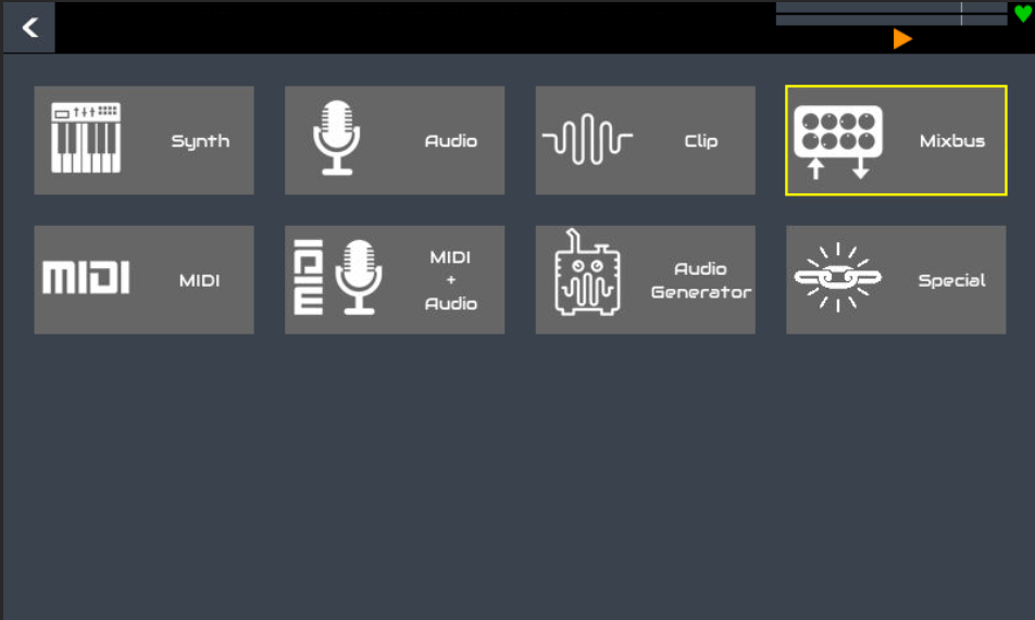
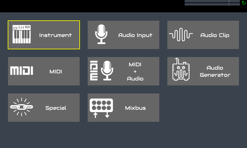
With all that unused space, why not have icons for “Add Synth” “Add Sampler” “Add Piano”
It honestly took my days to figure out that the Pianos are not in the Synth category .
but thats just me
It is not just you - it has been a recurring issue. The problem is that we have lots of catagories and each was created because we have so many processors that the list was just too long. This is the beginning of some work on improved (or at least, changed) navigation so there is much more to do. This view is effectively the same as a listbox view but it has pros and cons. There are lots of lists that may or may not benefit from this type of view.
I think @arguz ‘s idea of having a different icon for each major category of instrument at the top level is an excellent suggestion and it would be a step in the right direction towards making the categories more obvious.
But we also have categories for audio plugins, etc. So do we have a “top-level” grid of icons with:
Synths
Sampler
Piano
Organ
Acoustic
Percsussion
Delay
Distortion
Dynamics
Filter & EQ
Modulation
Panning & Spatial
Pitch
Reverb
Simulator
Analyzer
Other
Clip
Mixbus
Arpeggiator
Automation
Filter
Mapper
Other (again!!!)
MIDI & Audio (REPEAT ALL OF THE ABOVE!!!)
Generator
Oscillator
Other (yet again!!!)
Language
This completely confuses matters, losing the distinction between instruments, audio efects, etc. and makes for a massive list which loses all of the advantages of grouping.
I’d prefer instrument, because it refers to the type of chain, not to the type of instrument.
It is indeed a recurring issue. I think a non-functional representation of the fact there is more than synths would solve the problem. First thing coming to my mind is tabs on the top corner, with the active category focused. Second could be change the “category” widget into a short scrollable menu.
We could use a second-level grid selector with nice icons for the categories. Organizing in 4x3 we would have 12 categories, what should be enough => currently we have 11 audio-processor categories .
I recorded a new version of “Everything must flow” with the new Vangelis OS, with the idea to test the long awaited (at least for me) song mode. Well, it’s just a way to put phrases in row but it works.
The workflow is a bit slow but i think that with a few improvements it can be much more fast.
These are my proposal:
A copy-paste option for the whole phrase it’s essential to avoid copying single patterns. I mean not a simple duplicate option, wich is ok, but a way to copy a phrase in a new one with empty patterns, togheter with names, duration, tempo and so on.
Insert phrase should allow to choose between before and after.
Phrases view should scroll automatically while playing if they go out of the view.
A “stop” follow action could be very usefull at the end of a song.
I tried to set play mode of unused pattern to “disabled”, just to improve visibility, but when i reload the snapshot the playmode is always saved as “oneshot”.
If these ideas are possible i could do a feature request.
Here is the video of the workflow i did to record the song and the snapshot, in case anyone would like to test it.
One more thing… everytime i do “Clean pattern ALL” i have a crash error.